Appliances eCommerce
Frigidaire is one of the most adored appliance brands in America. Owned by the parent company, Electrolux, Frigidaire offers a wide array of home appliances. Online, users can browse product catalogs, find user manuals and get inspiration and tips on how to style their kitchen.
As one can imagine, the vast amount of product offerings can be overwhelming. Site visitors have different needs based on the appliances they're looking for. Once they find the right category, they needed a way to compare them intelligently. Finally, we saw an uptick in search traffic looking for maintenance and support content.
ROLE
Experience Planning, Information Architecture, UX/UI
Competitive + CONTENT Audit
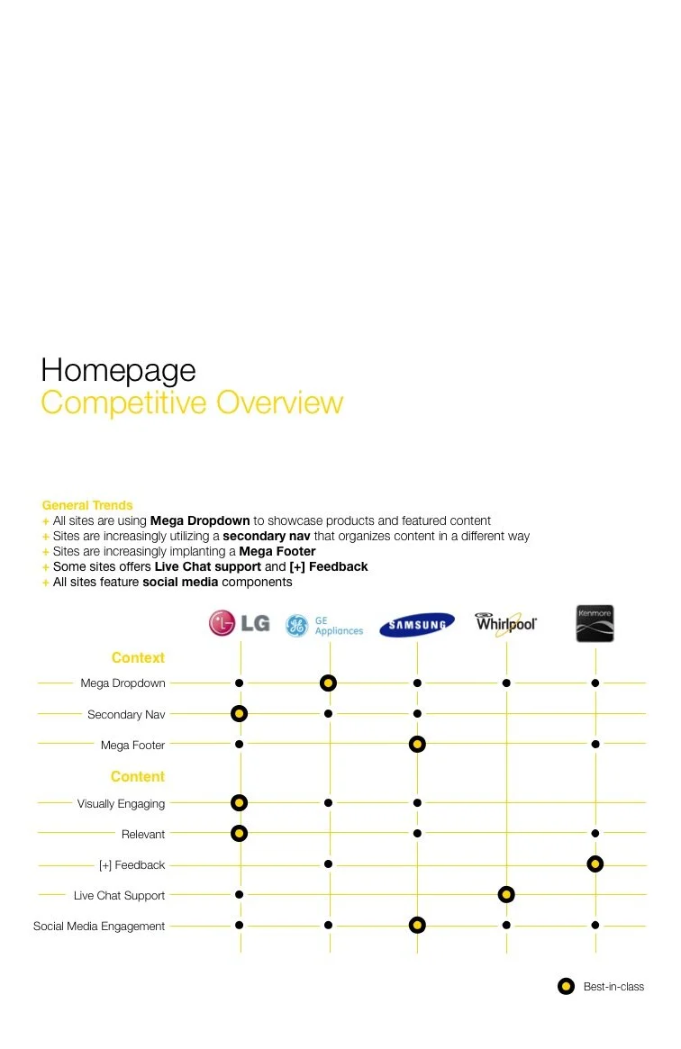
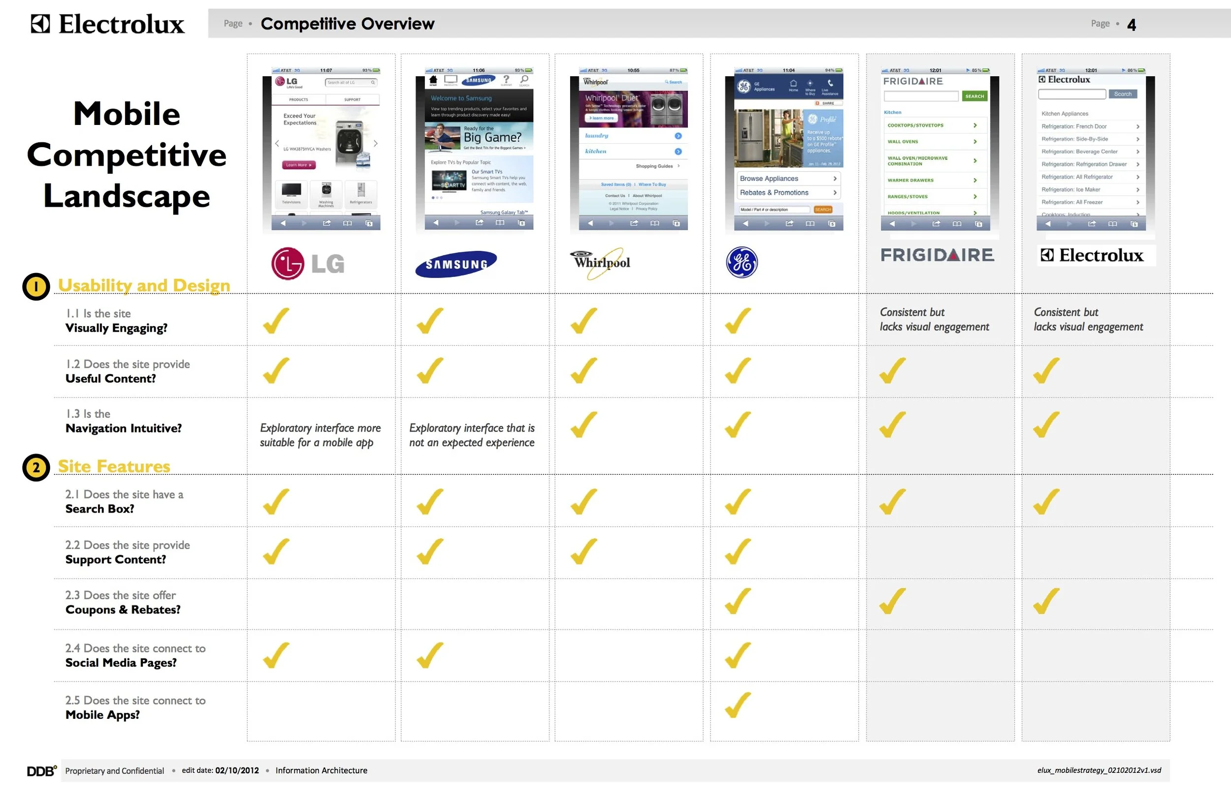
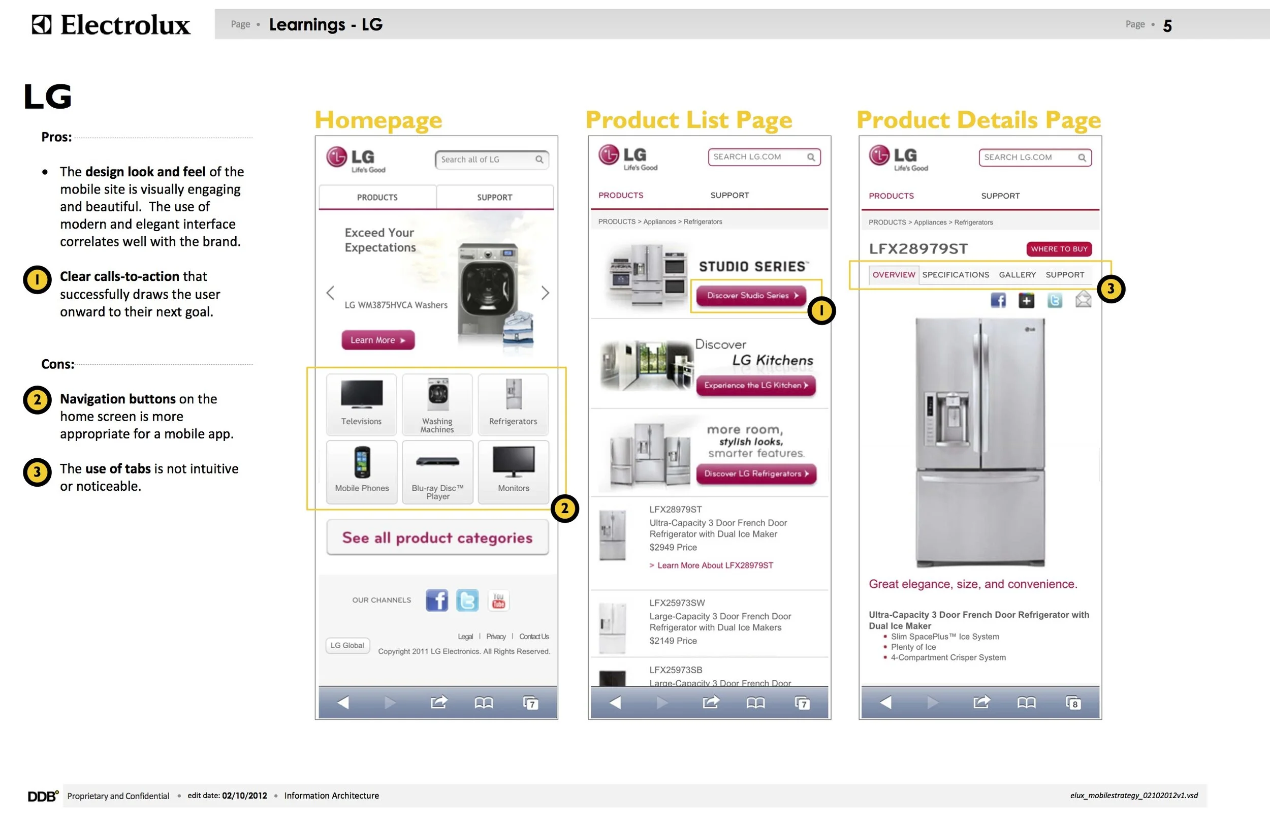
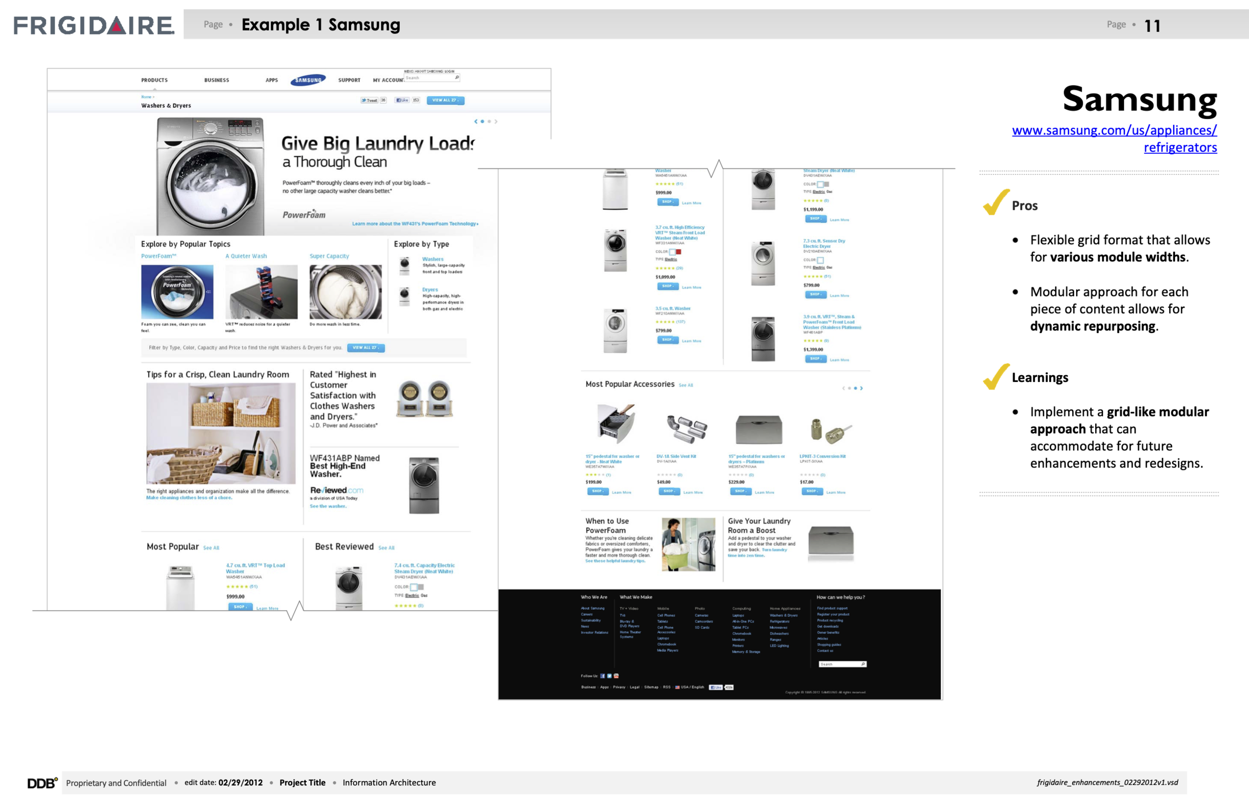
The team broke off into smaller groups to tackle additional discovery initiatives - account teams conducted focus groups for the rebrand and look + feel while the experience team conducted competitive audit to gather industry benchmarks and find ideas to enhance our core features and offerings.
*Some sample pages from the competitive audit. (This was a comprehensive deck that comprised of findings for both Frigidaire and Electrolux.) The biggest take-away from this research is the utilization of responsive mobile sites, which is already a part of the plan for the relaunch.
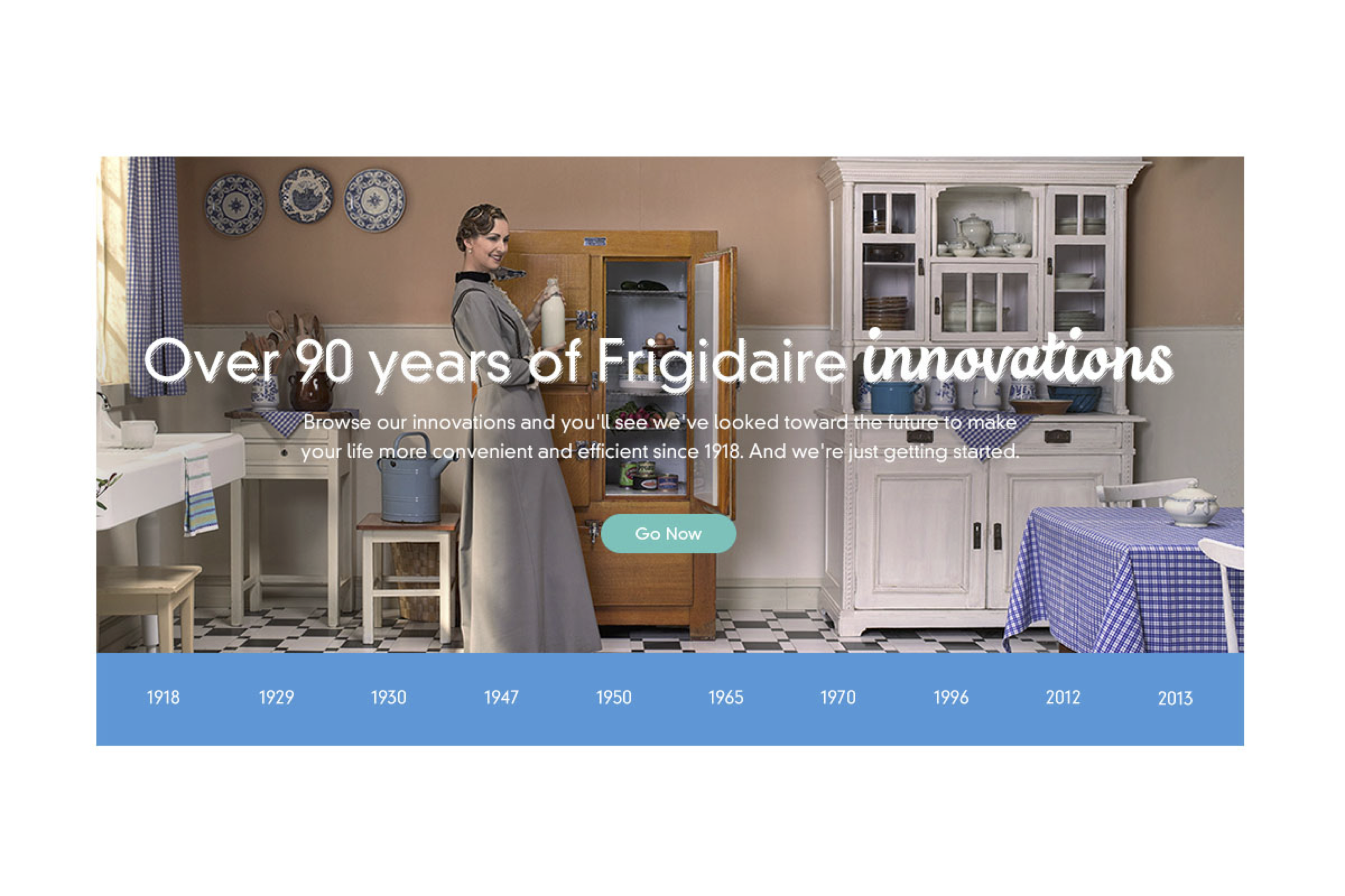
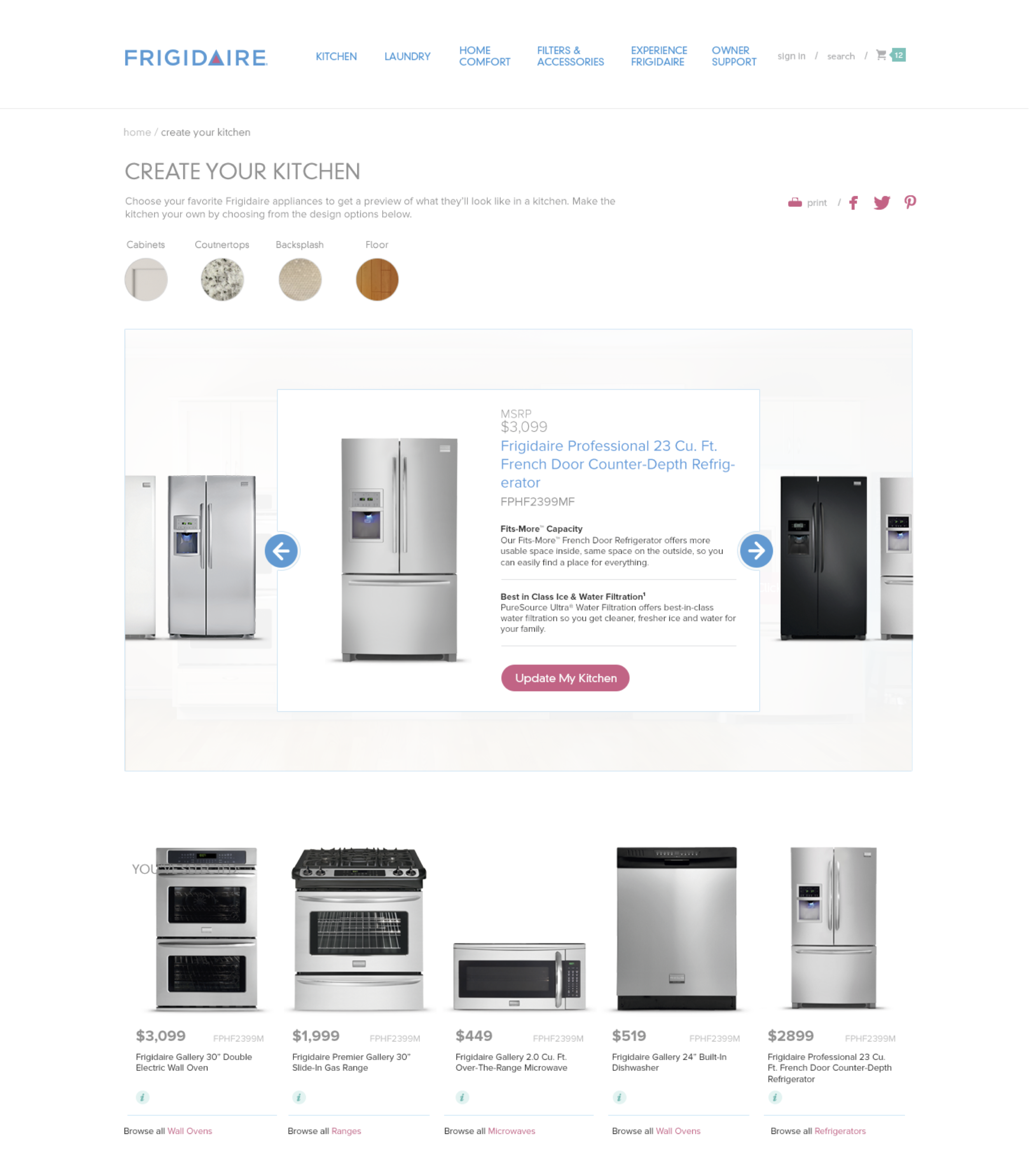
For the content audit, I worked with data scientist to identify sections and features that worked well on the existing site - this included the product comparison chart, quick-view overlay and zoom features, all of which to be reimagined with the redesign. Collaborating with the strategy team, we came up with a list of experiences that can help enhance user’s connection with the Frigidaire brand - this translated to the timeline, kitchen visualizer and inspiration galleries.
Strategic Planning
Working closely with account, strategy and client teams on discovery, we developed an experience planning brief that described a series of requirements from business and user perspectives. Frigidaire targets cost-conscious consumers and young professionals who cares about tech trends but is more reserved when it comes to spending. (Through focus groups and usability studies from a previous iteration, we know that the audience is very knowledgable about the product, they compares features across products and across brands, and many of them like doing their research at home first before hitting the stores.)
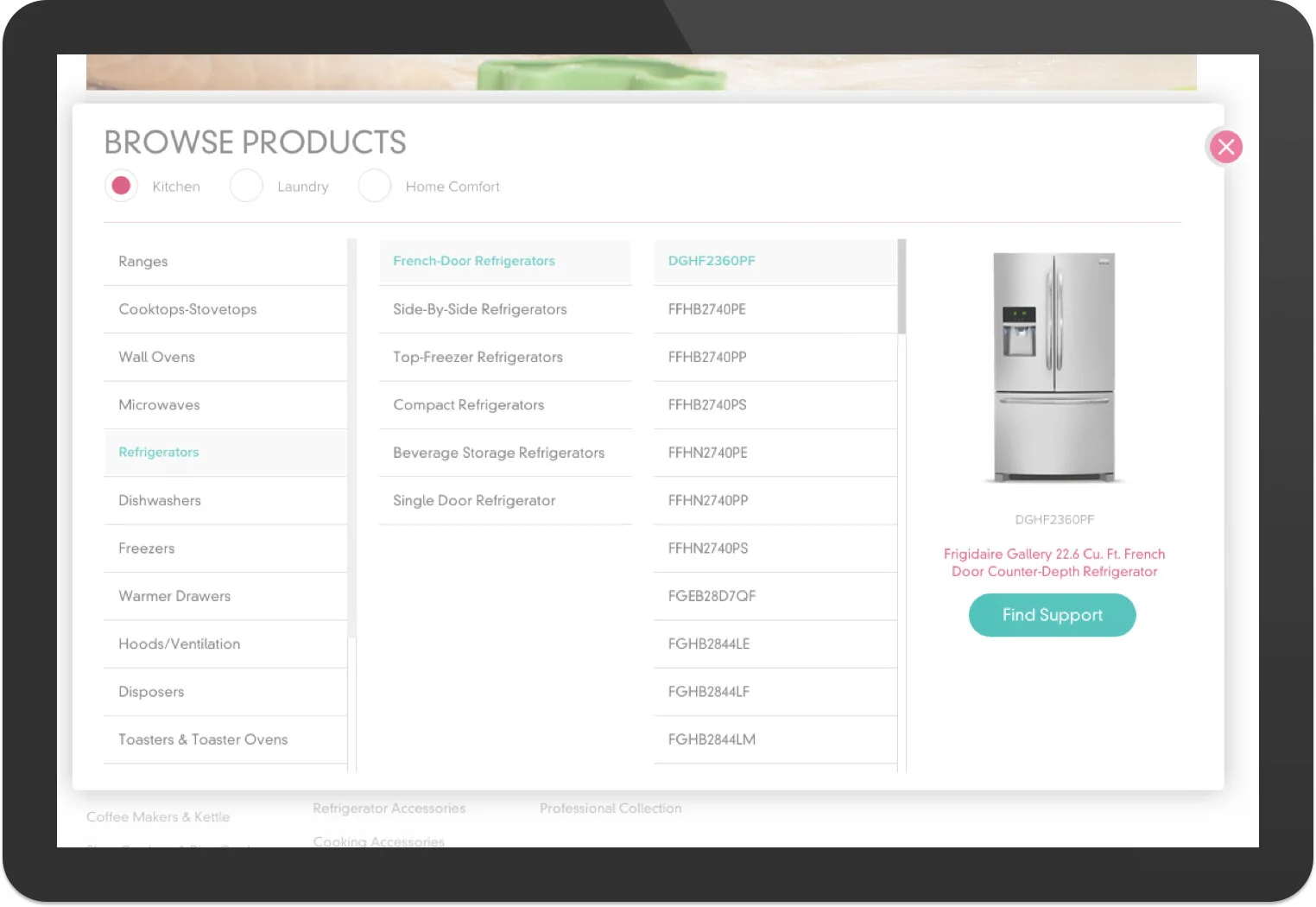
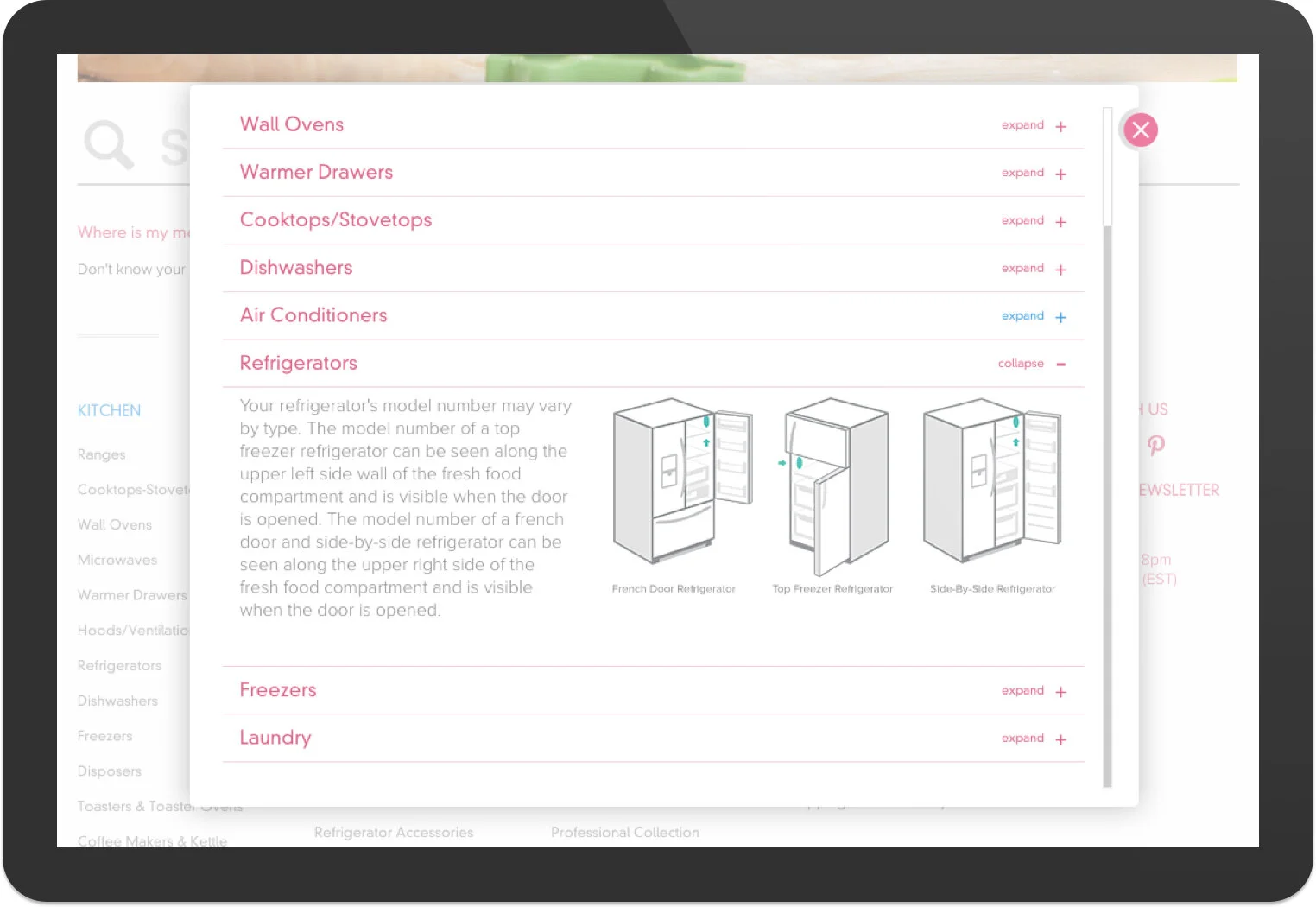
From the business perspective, we need a design solution that satisfies seasonal and periodic marketing updates - a modular approach for all page types that can accommodate for various content types, and increase ROI by providing owner support content. From the customer's perspective, we need to increase findability amongst the wide array of product offerings, help users compare within the same category, and provide different ways to help customers narrow down their search.
INFORMATION ARCHITECTURE
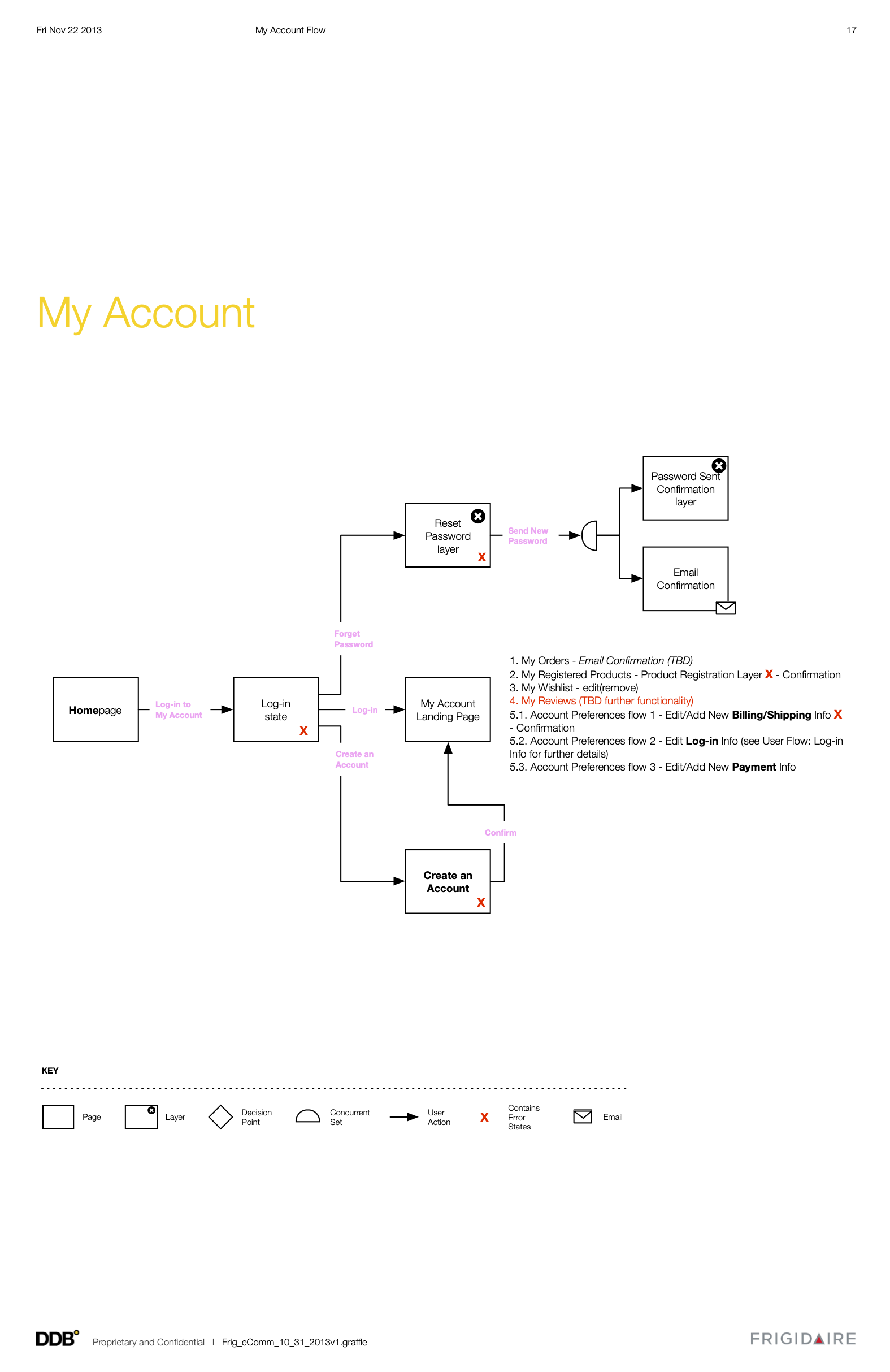
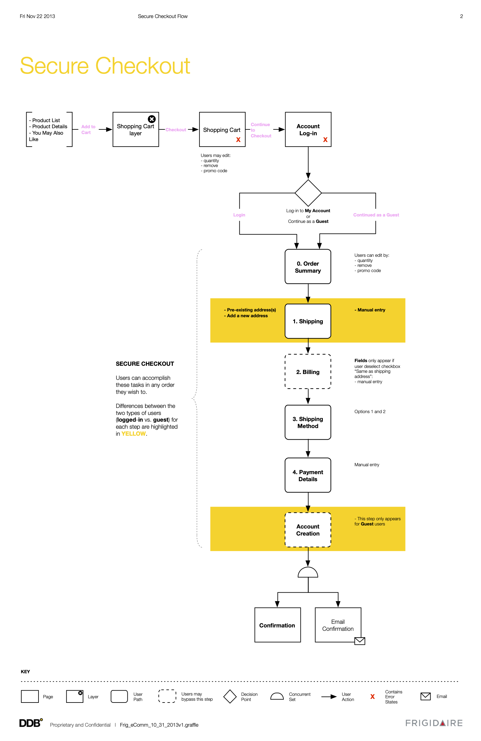
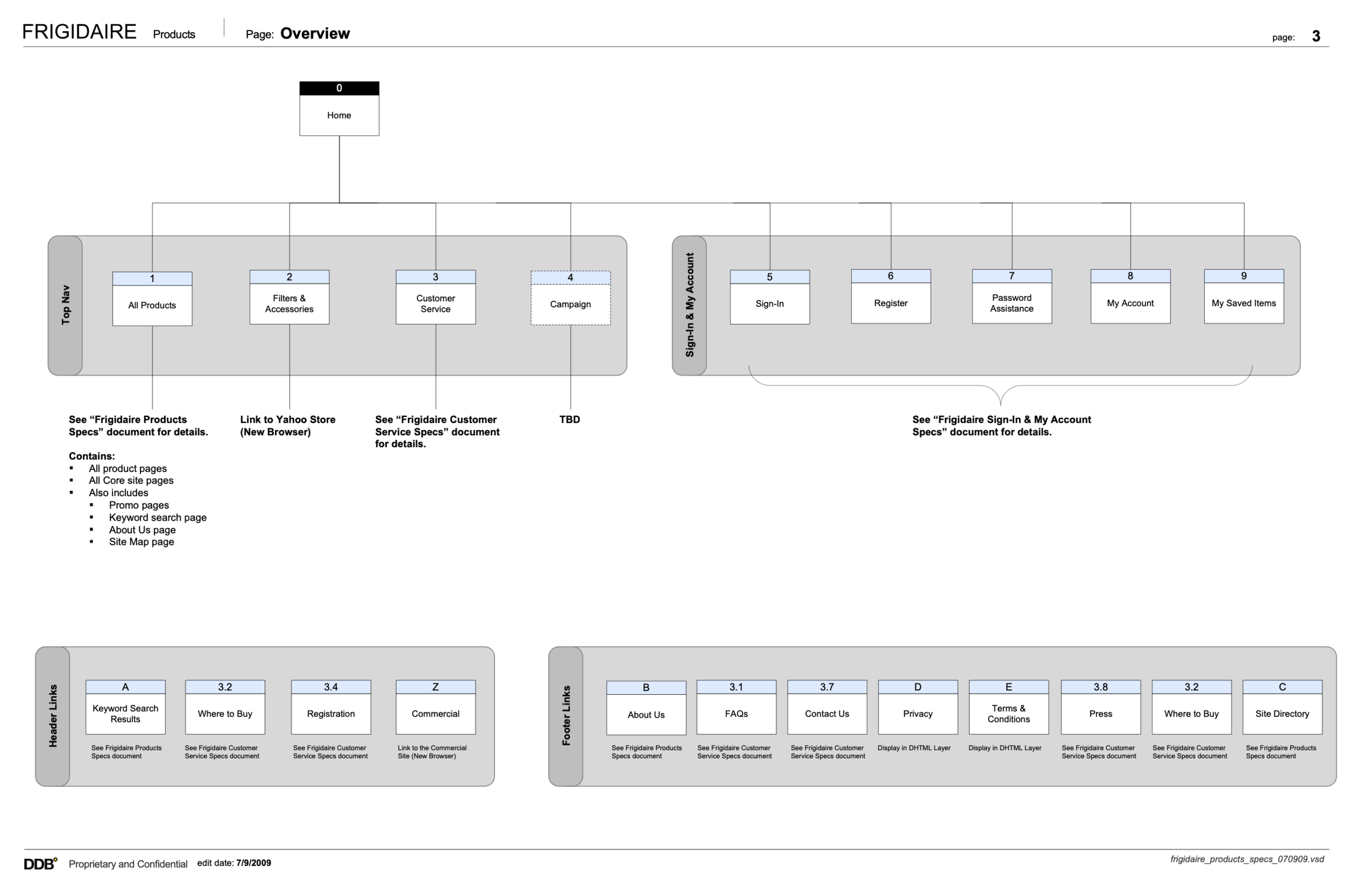
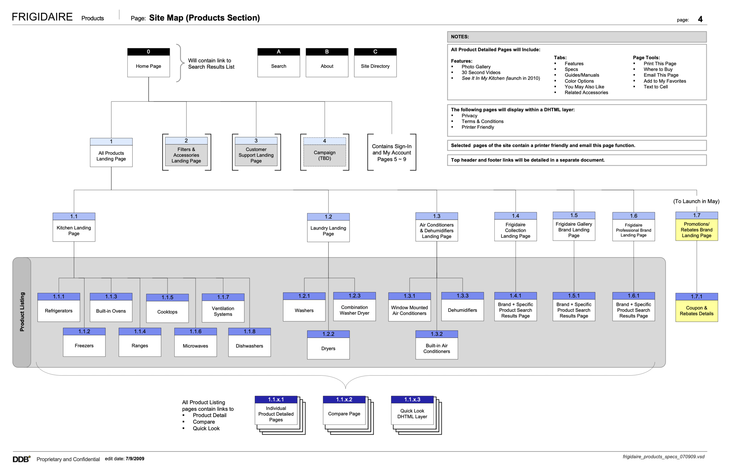
To kick off production and design, I first created site maps to account for all the pages on the site. The site maps then served as a discussion point with the constituents to determine new pages and areas of opportunities. Once the site structure is locked down, we then identified sections that are more complex where user flows are needed. I then created wireframe concepts to illustrate any new sections or ideas the team had.
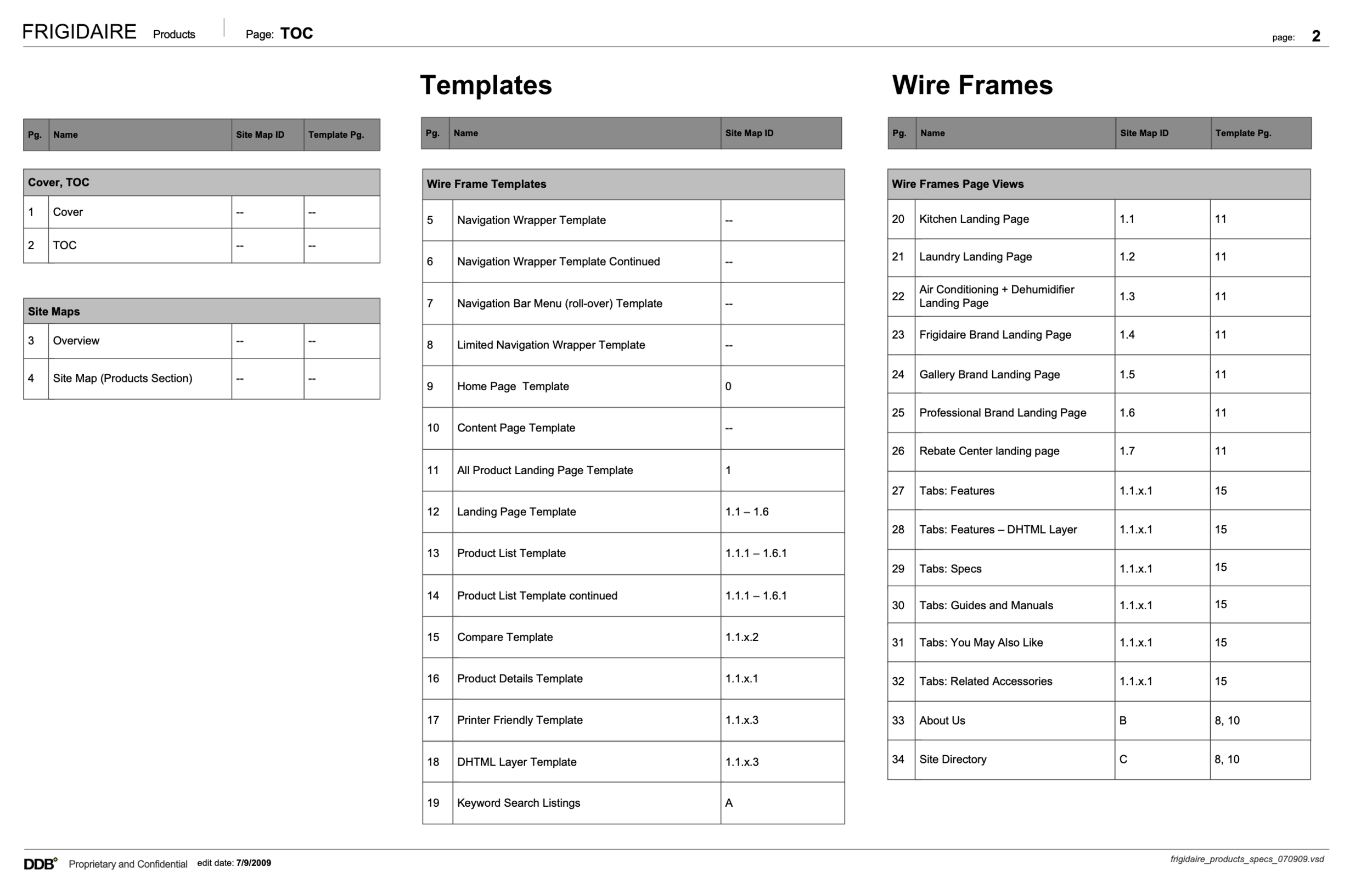
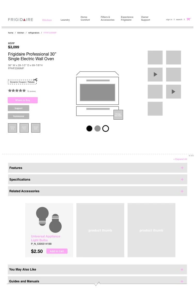
Once wireframe concepts are approved, I move on to production-level wireframes, which is broken down by the core site, checkout and account, search results, and owner support sections. Due to the many moving parts and collaboration across various production teams, the documentations had to be clear, easy to understand and comprehensive. One of the positive feedbacks I received was on the table of contents page that clearly illustrated mappings to site map IDs and template IDs, which proved to be extremely helpful for the production process.
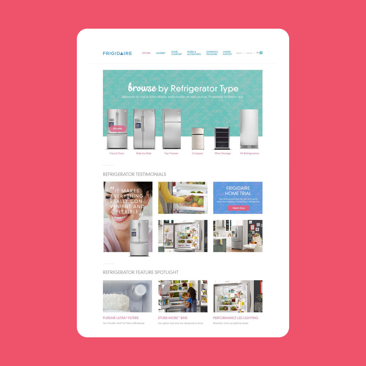
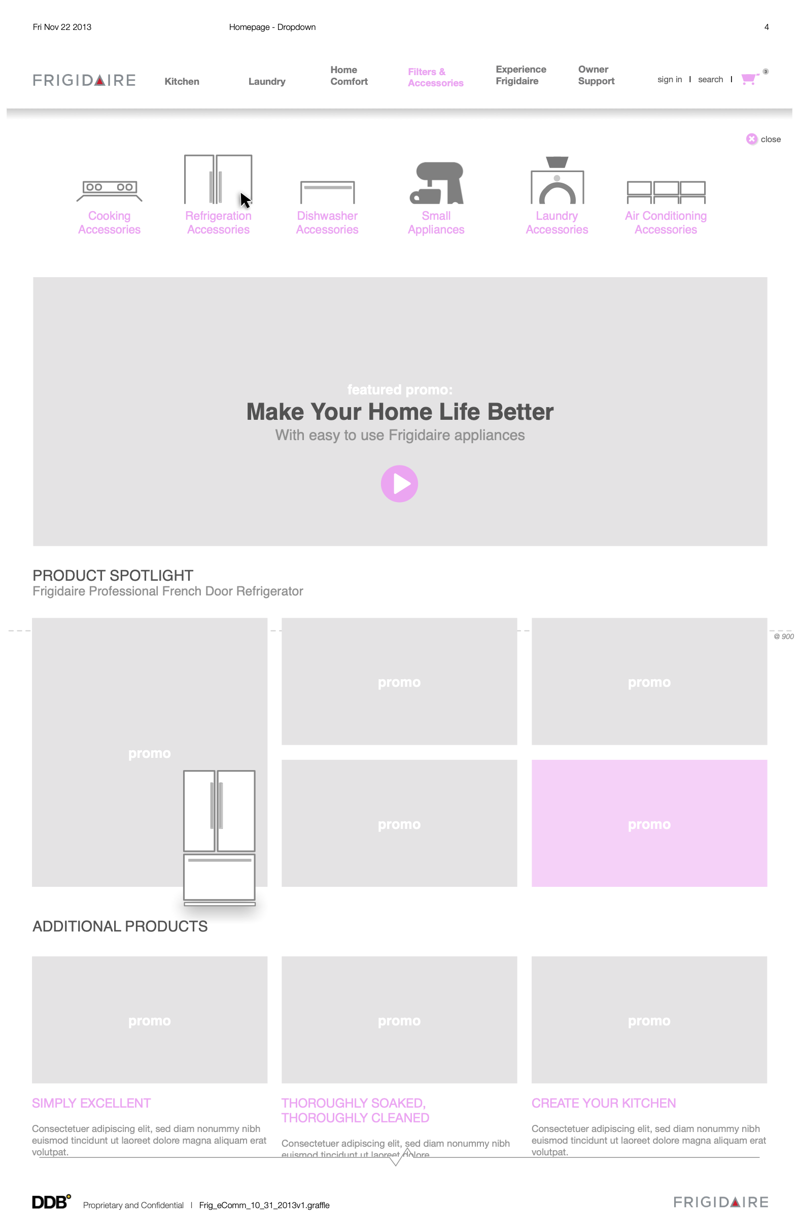
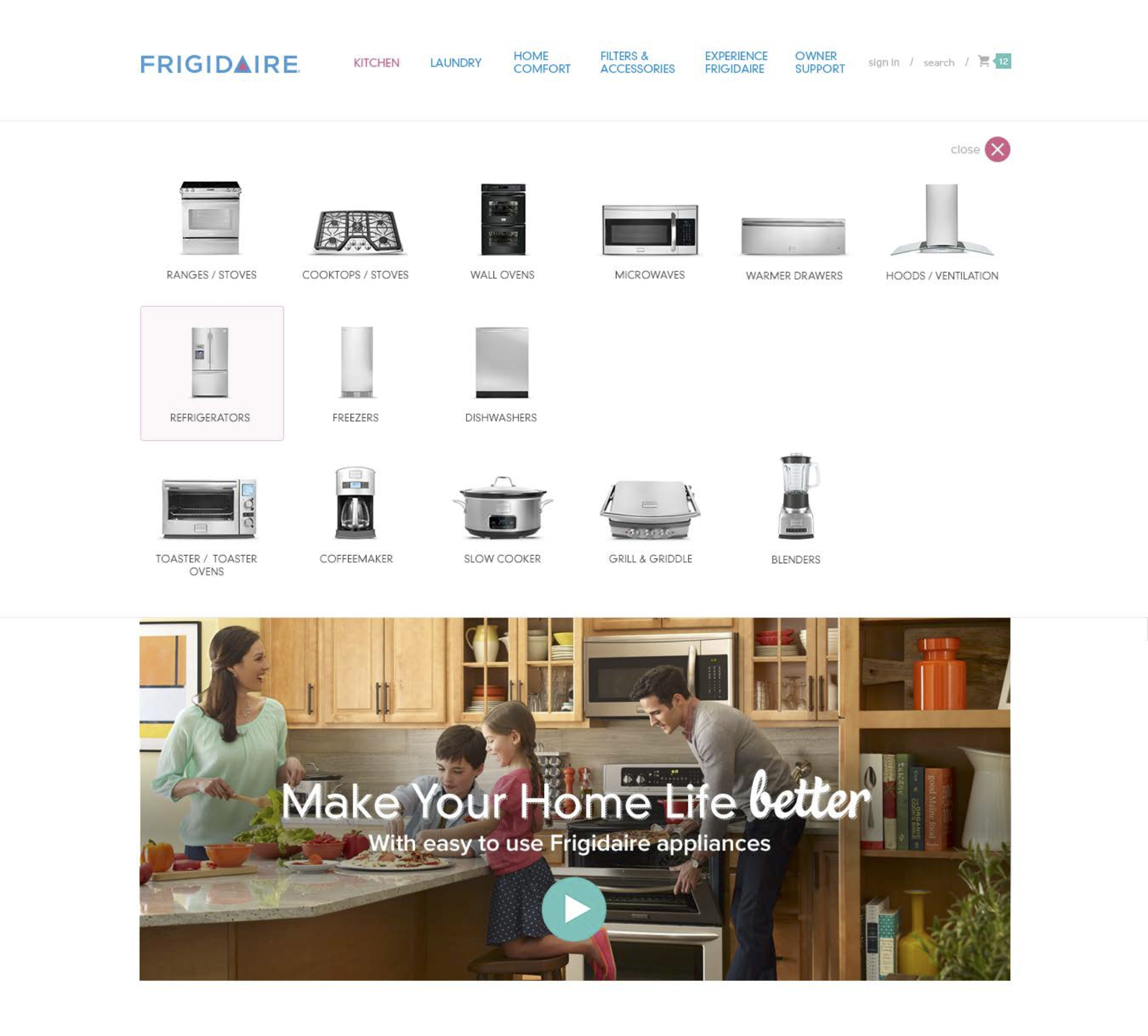
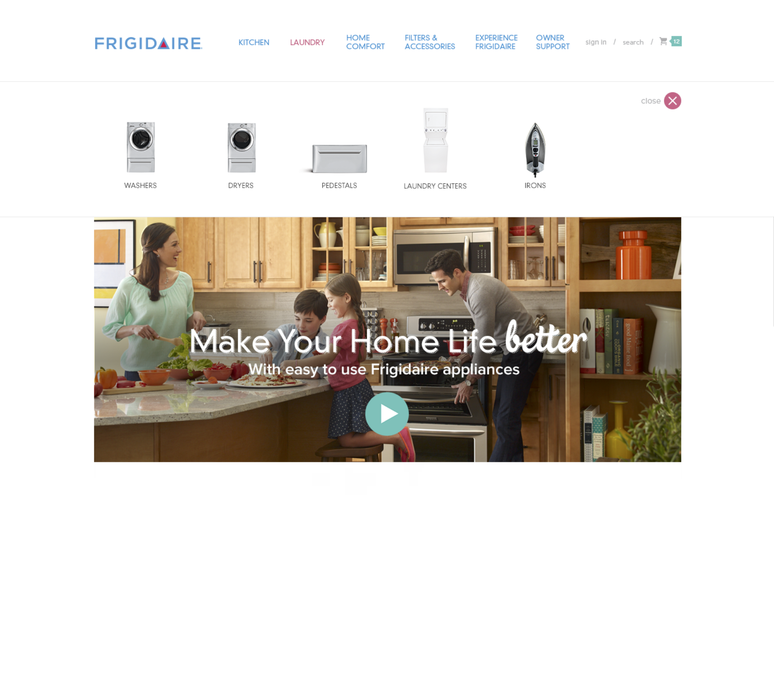
Initial usability tests revealed that users had a difficult time scanning through appliance categories in text format. With this redesign, we introduced visual thumbnails that are integrated into the mega menu. This allows users to scan through visual cues to quickly find the category they are looking for.
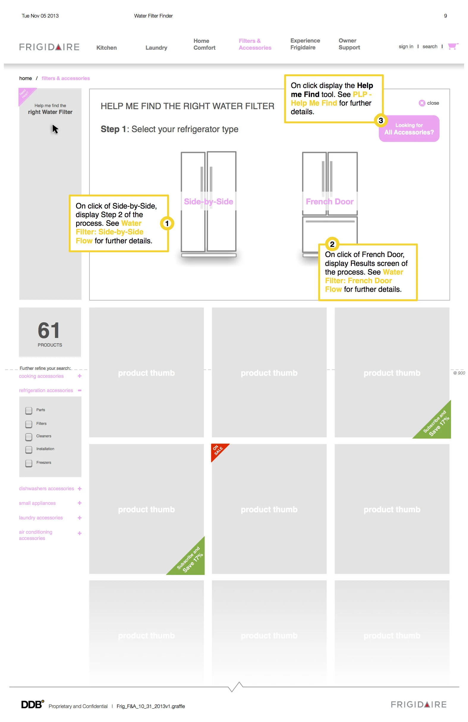
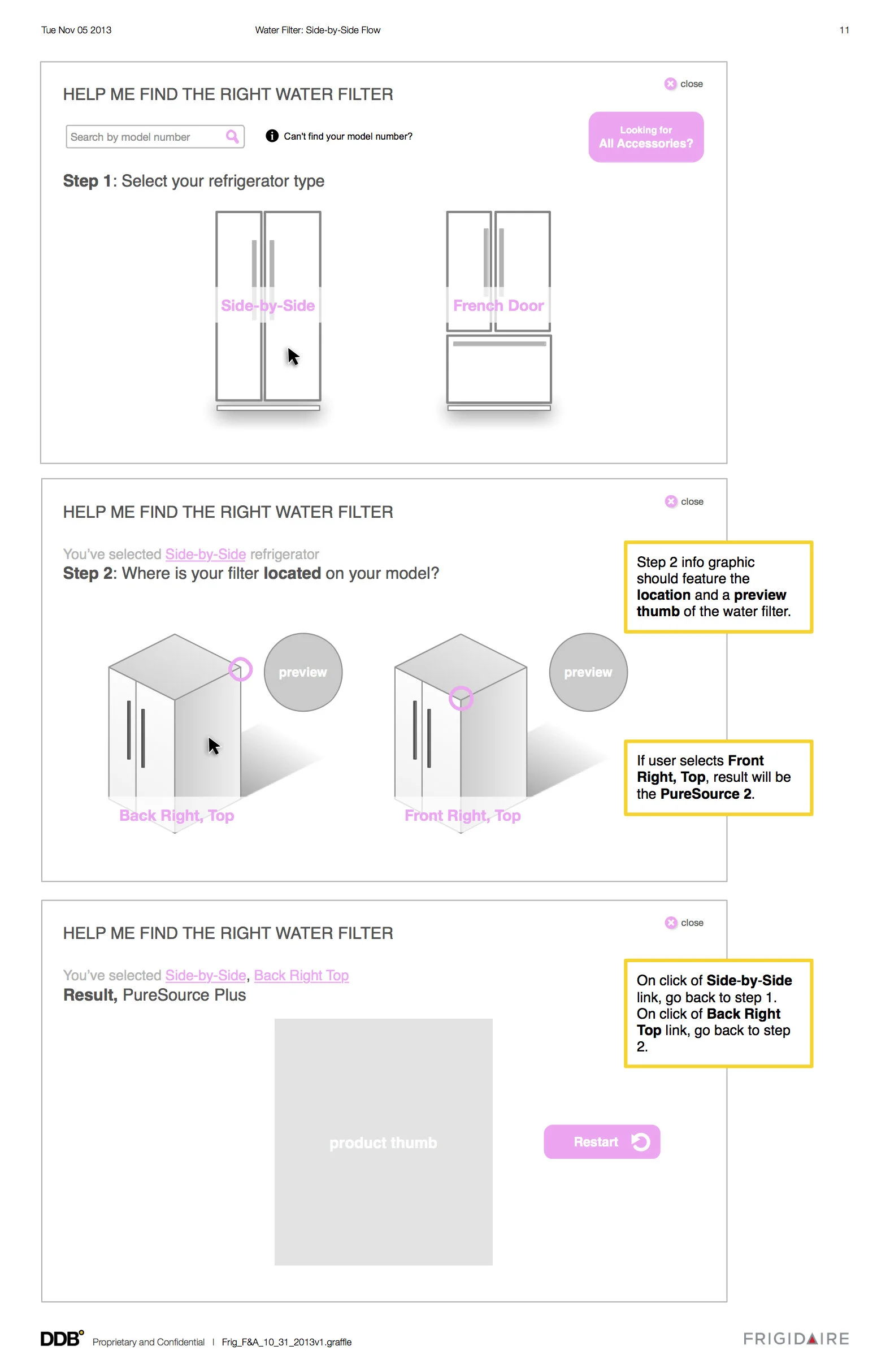
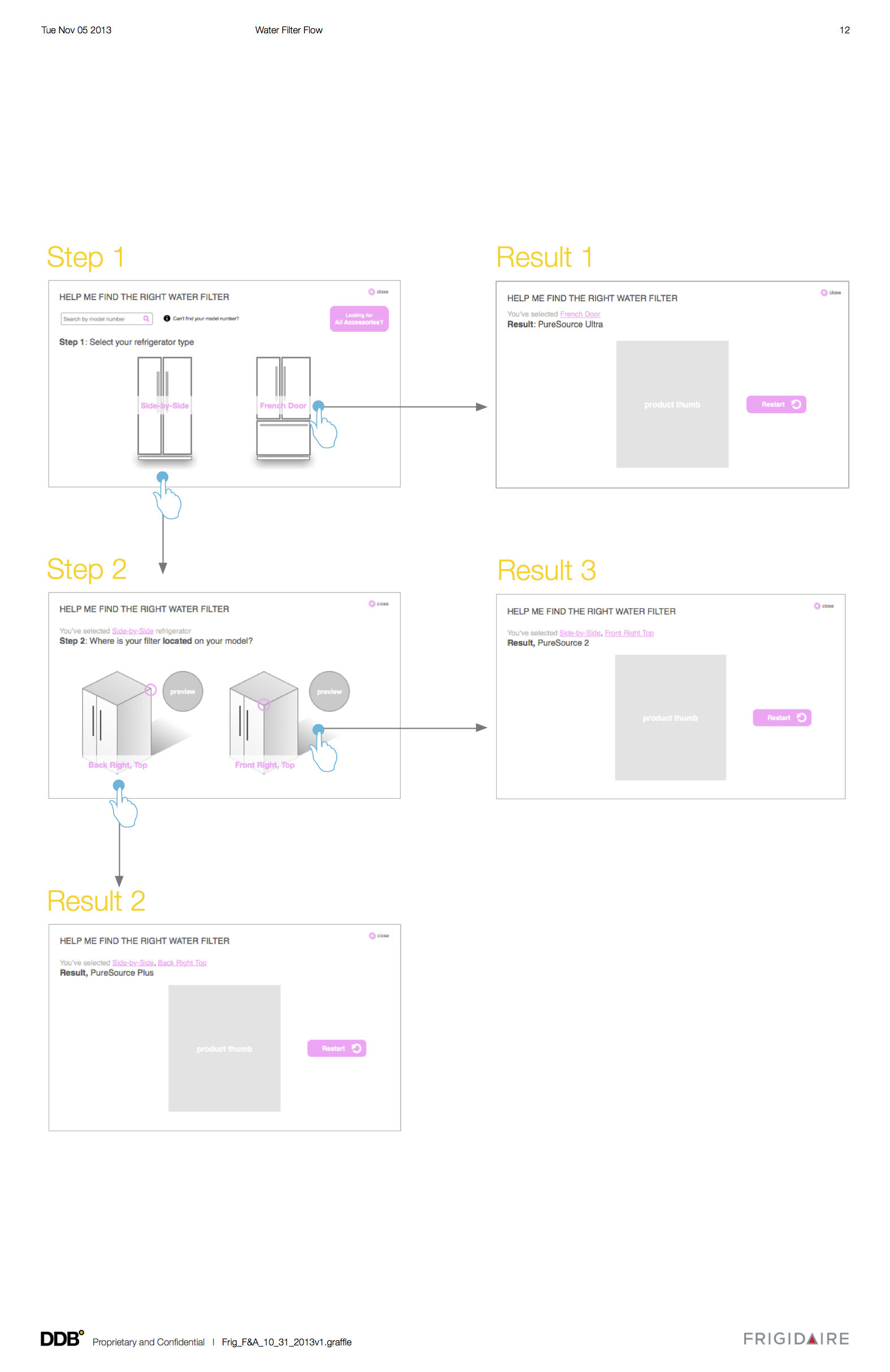
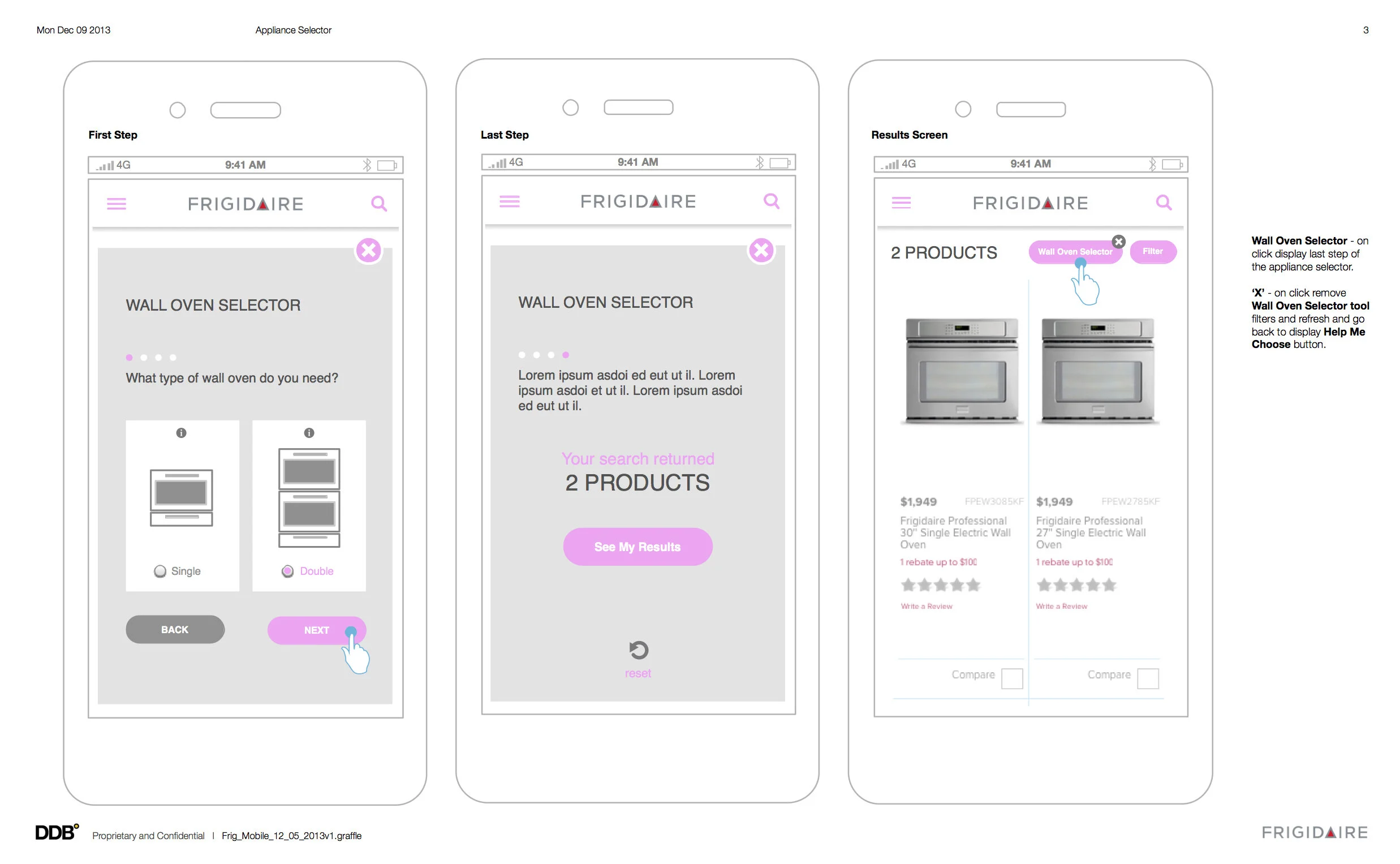
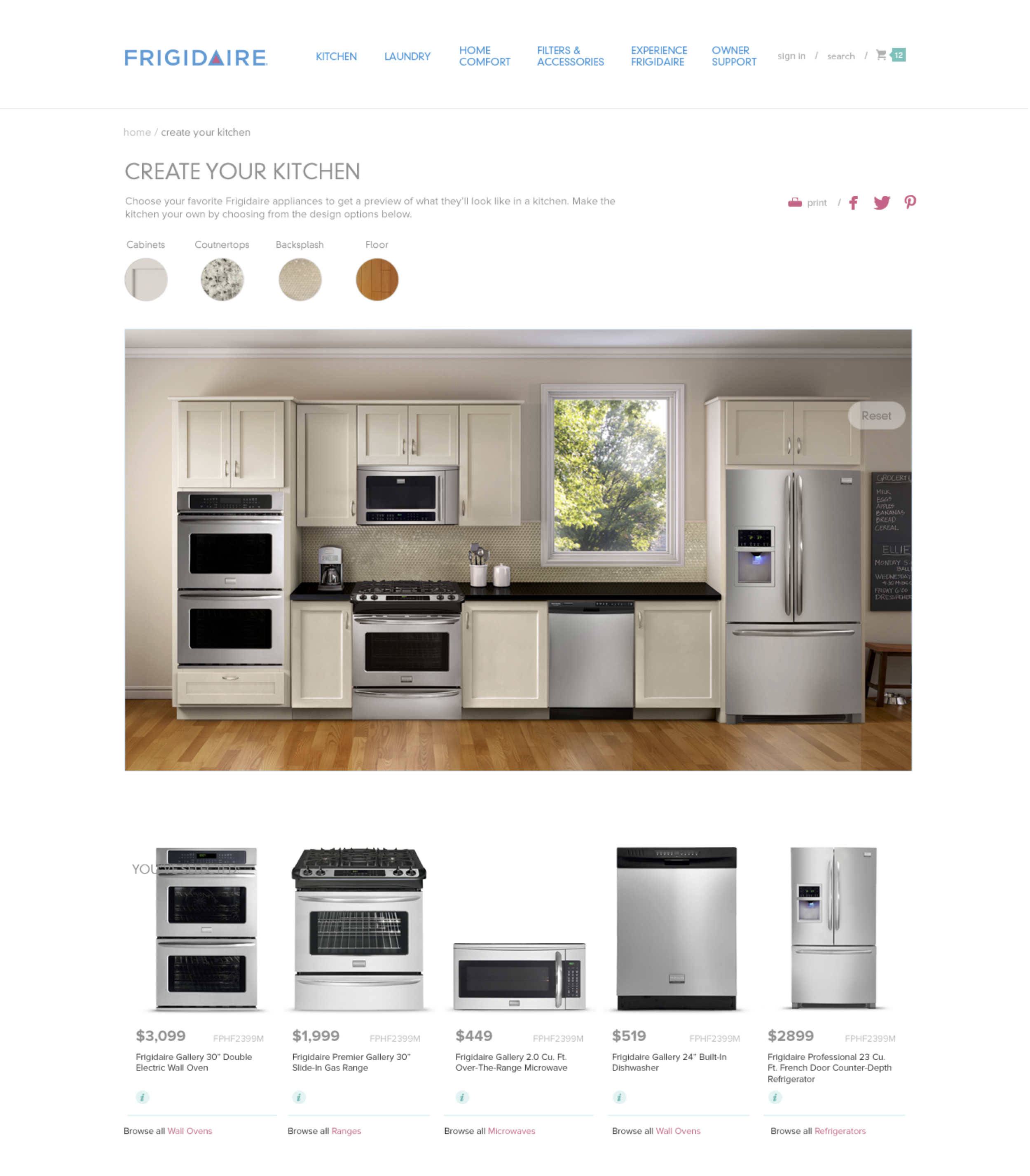
To make shopping comparison easier for our customers, we created a suite of tools to help users get to their products quicker. This was done by adding the 'help-me-find' widget, improving feature comparisons on quick view overlays, adding different tags to denote new or sale products, and provide inspirational galleries and kitchen visualizers to help customers imagine their future kitchens.
Furthermore, traffic from mobile devices have increased over 60%. Many customers are searching for product information as they browse in stores. All screens are designed responsively at three different breakpoints to accommodate for desktop, tablet and mobile devices.
Design approach
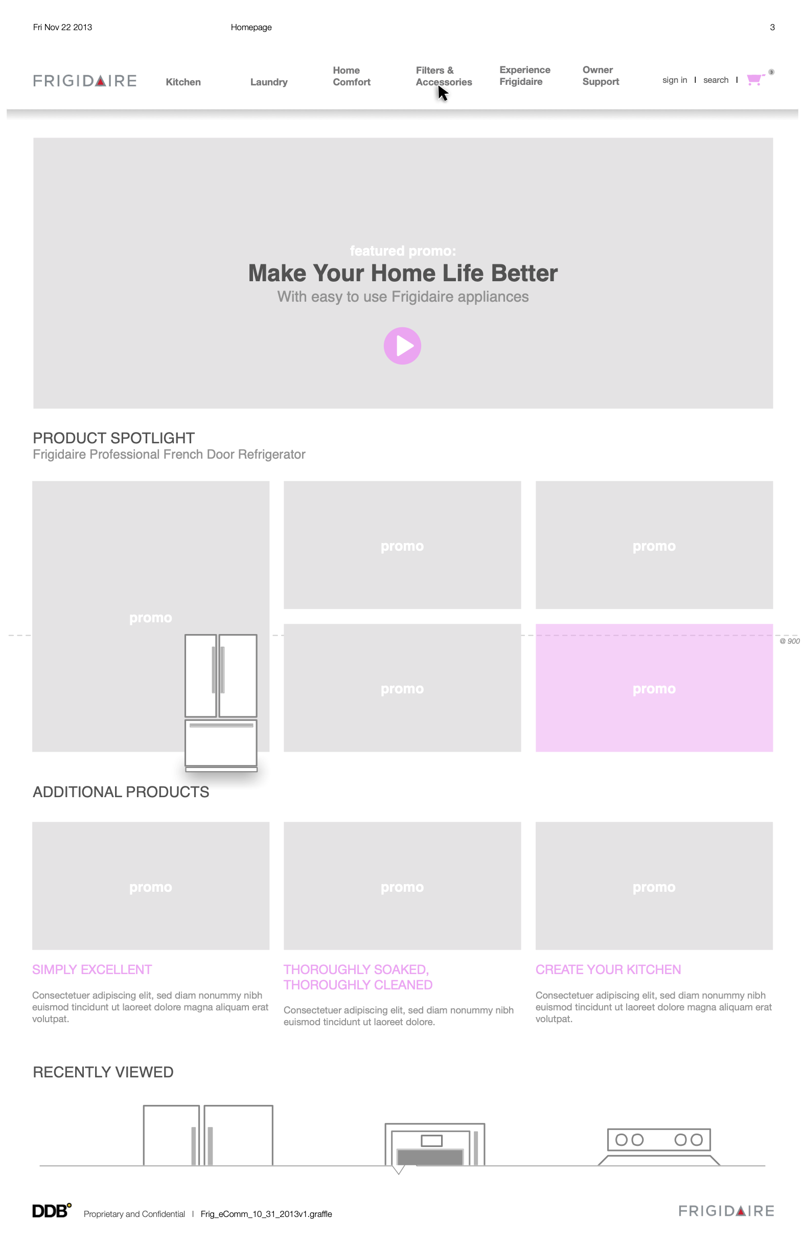
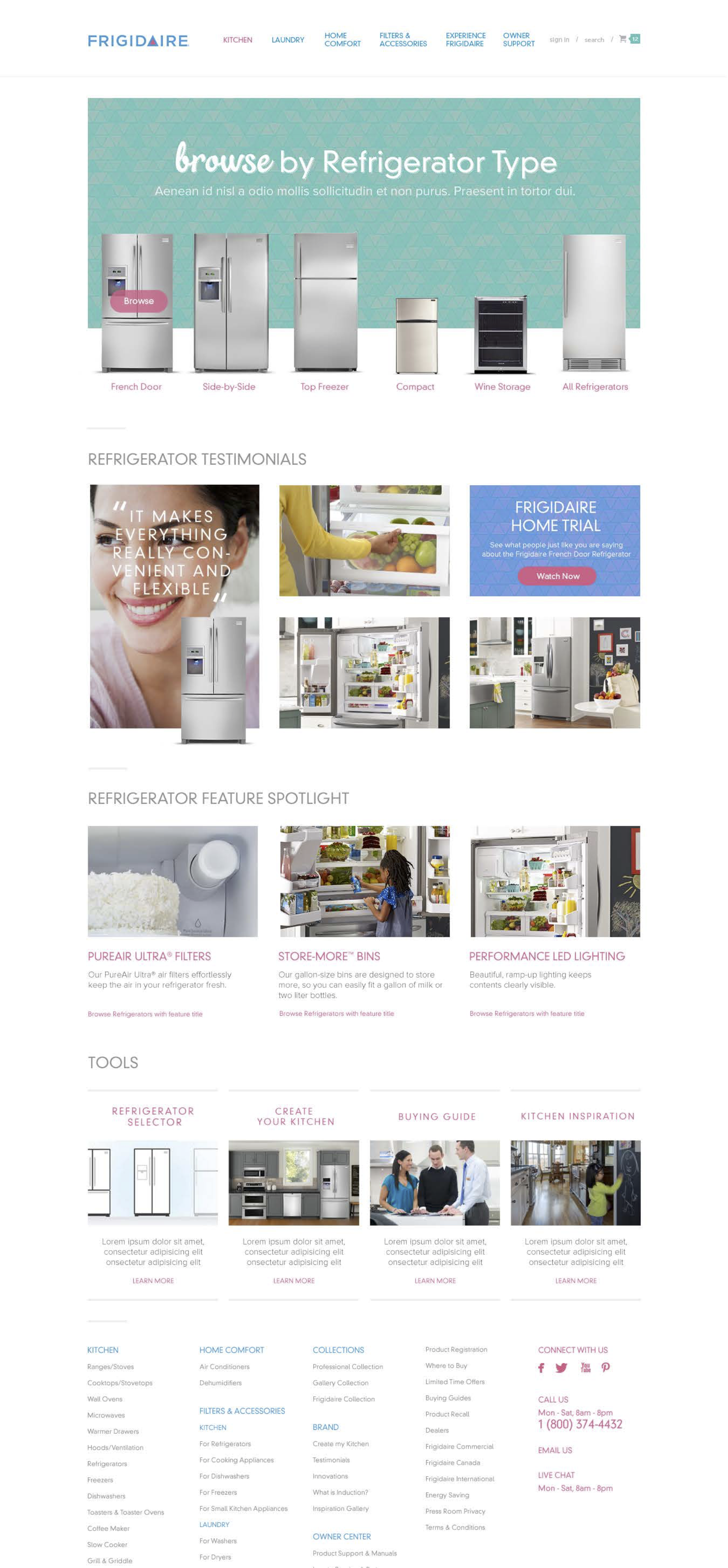
We created the following page types in a modular format that can satisfy both user goals and marketing objectives:
homepage
landing page
listing page
detail page
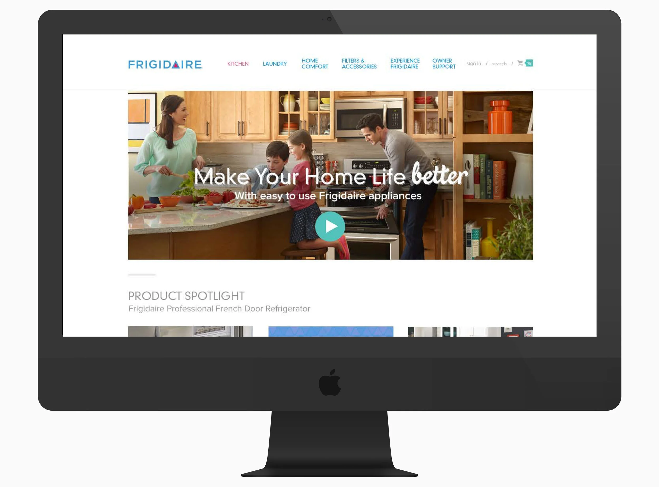
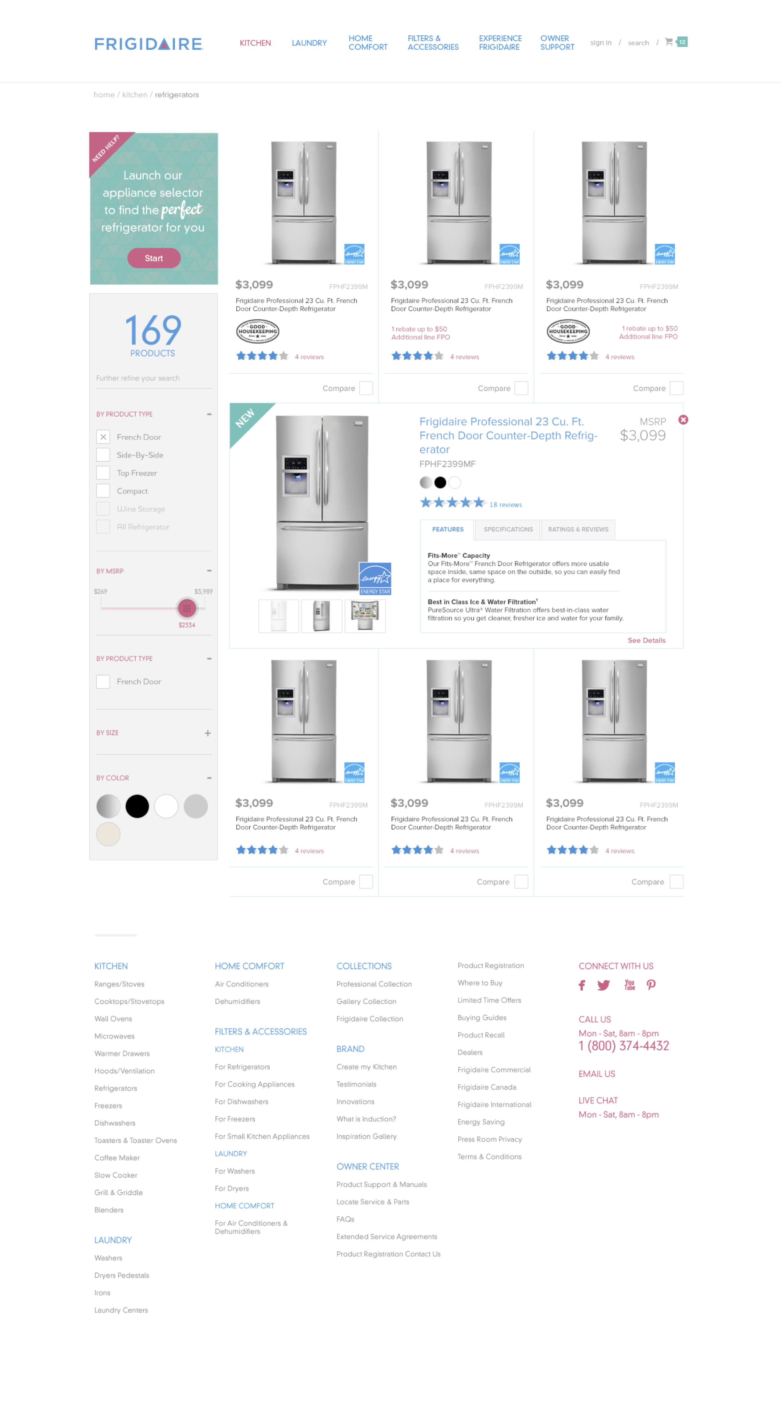
Homepage and landing page templates accommodates various content blocks that can be added for marketing updates. Landing pages are designed to accommodate product categories and collections. Listing pages empowers users to narrow their search by relevant filters and 'help me find' widgets. And detail pages are carved out in a way where users can easily find support content and find relevant accessories. Each of these page types are built modularly where different content types can be turned on or off depending on the need for the category or the product.
Iterative Process
Overall, the relaunch was very well received. Post-launch focus groups described the site as 'delightful' and 'feels fresh'. Over 70% of the attendees were able to get to their desired products within 3 ~ 5 clicks, all of the attendees were able to find accessories for their appliances either from the accessory finder or the product detail page, and owner support content proved to be more useful than originally anticipated.
After the website relaunch, we continue to gather feedback and optimize based on what users are searching for. The team continued to create new tools for different product categories. Finally, support content traffic has increased dramatically where it warranted its own spot on the homepage.
