Citi’s ThankYou.com
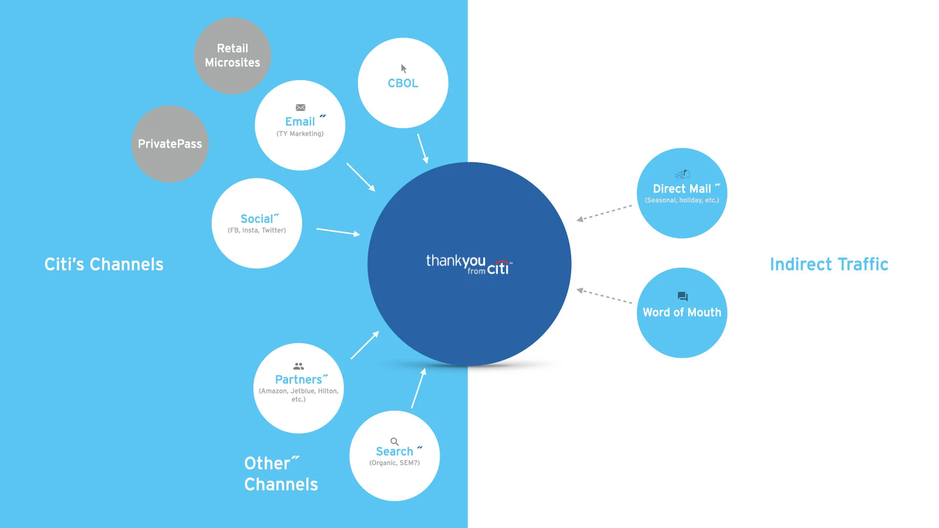
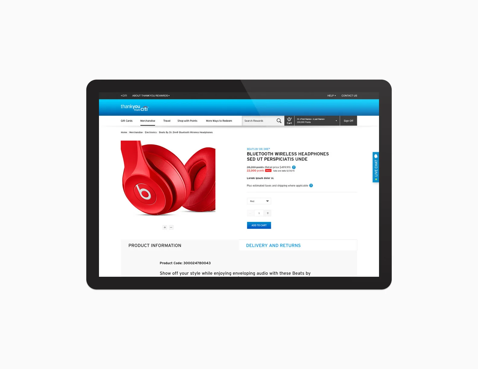
ThankYou.com has been a long-time favorite for credit card rewards. Rewards offered include merchandise + gift cards, travel, and points transfer. Due to customer demand and competition, the program has expanded to include experiences and points transfer to Amazon. The popularity of the program has driven Citi to expand to various markets across the world, all with a slight variation in its offerings and fulfillment.
While I worked on a wide array of design and production efforts for the platform, this case study is going to focus on the strategy that lead up to the redesign and describe some of the UX challenges we resolved with the redesign launch.
Role
ACD UX
Overview
Over the expansion of the program, ThankYou.com has become overly cluttered and inconsistent across markets. The redesign focuses on making the following improvements:
Bring all global rewards websites to communicate under the same design language as ThankYou.com
Creating a flexible design system that can accommodate for variations across markets
Deliver best-in-class usability for customers to quickly find the rewards that matters most to them and complete their transactions seamlessly
Mobile first for design and performance
Initial Experience Audit
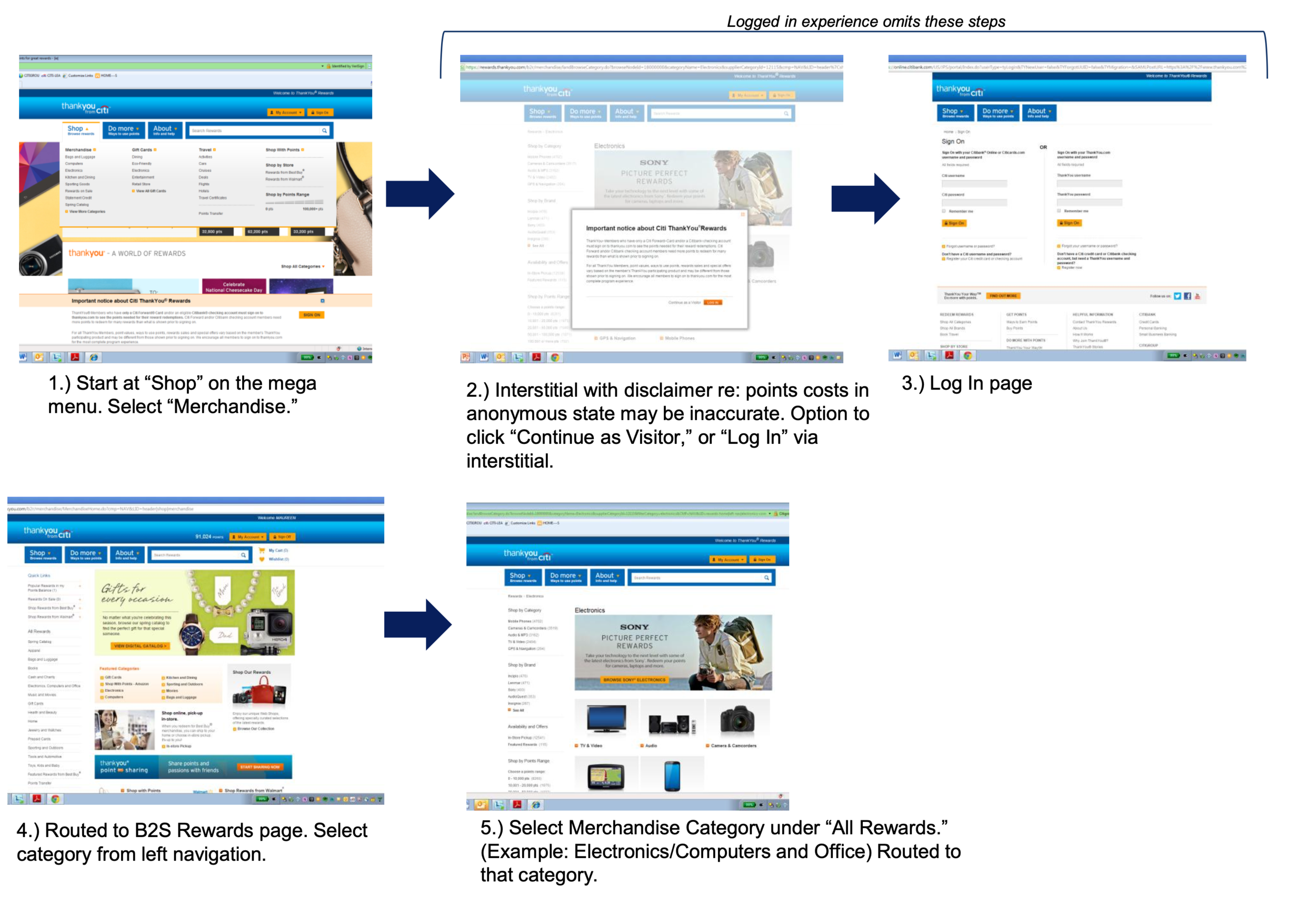
We conducted an end-to-end review of the platform to identify areas for improvement, broken down by homepage, merchandise/gift card, travel, points transfer, check-out and account servicing. A few key findings attributes to the poor experience:
Homepage too cluttered and lacks visual hierarchy
Mega menu is poorly organized and hard to use
Information lacking on program, product and account details
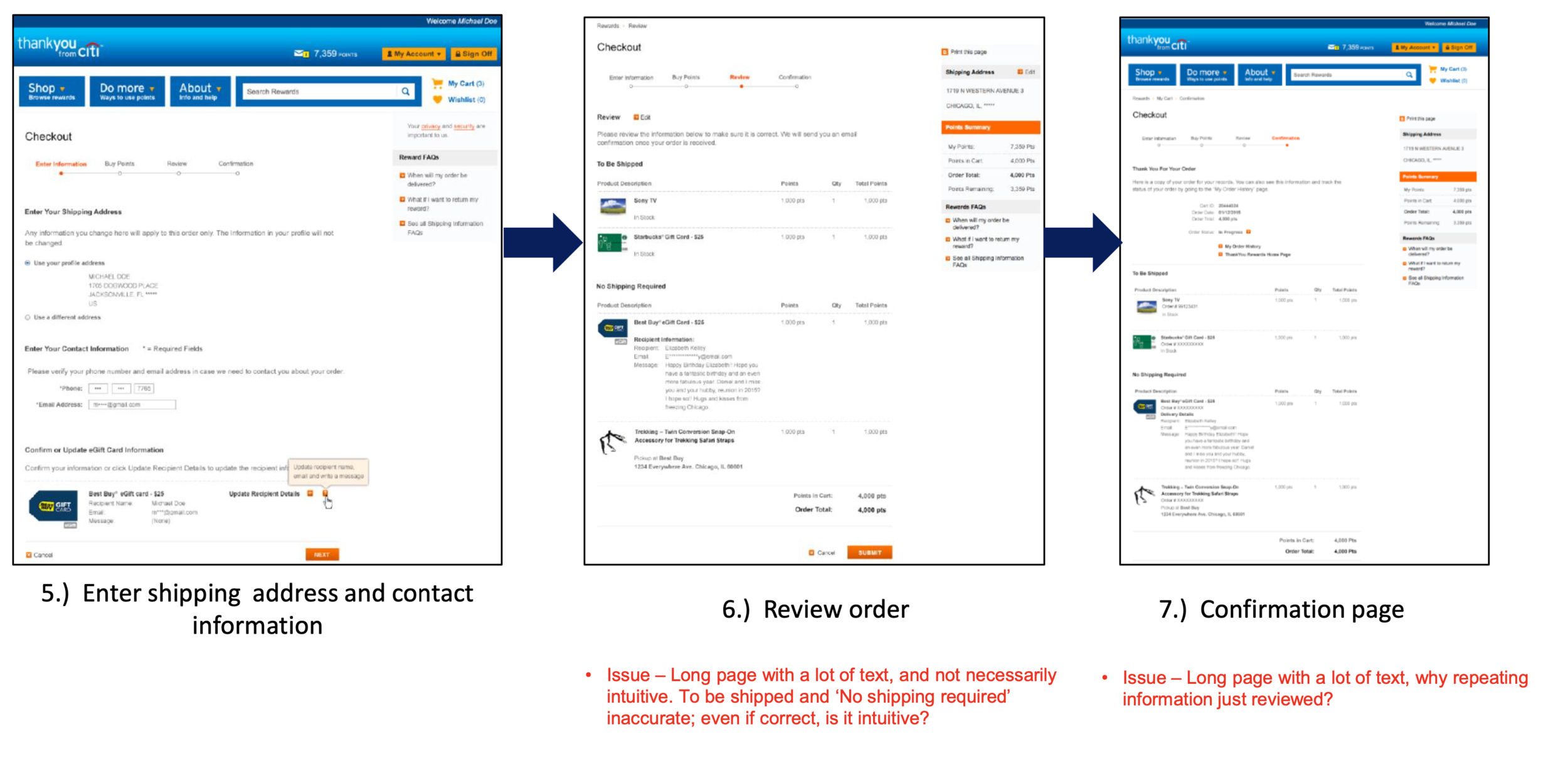
The checkout process is a few clicks too many, with some as many as 8 steps
Categories across global markets are not as intuitive
Approach and Client Collaboration
This effort spanned across 3+ years - once design is complete and finalized for the US market, the team took a staggered approach to gather market differentiations and identify new components needed to accommodate for specific market offerings. ACD design and I worked closely to identify templates that can be utilized for each market variation and divvied up design and UX requirements to guide our respective teams.
To ensure our designs are modular and consistent, I created this framework slide to illustrate the flexibility of our templates. With the US market, most of the modules are utilized. For global rewards, each module can be turned on and off depending on the market need.
To ensure all pages are accounted for in production, I created this initial site map for the US market illustrating all of the sections of the site. With each market release, we used this as a reference, then cut away the unnecessary sections for each variation.
UX CHALLENGE 1: Navigation
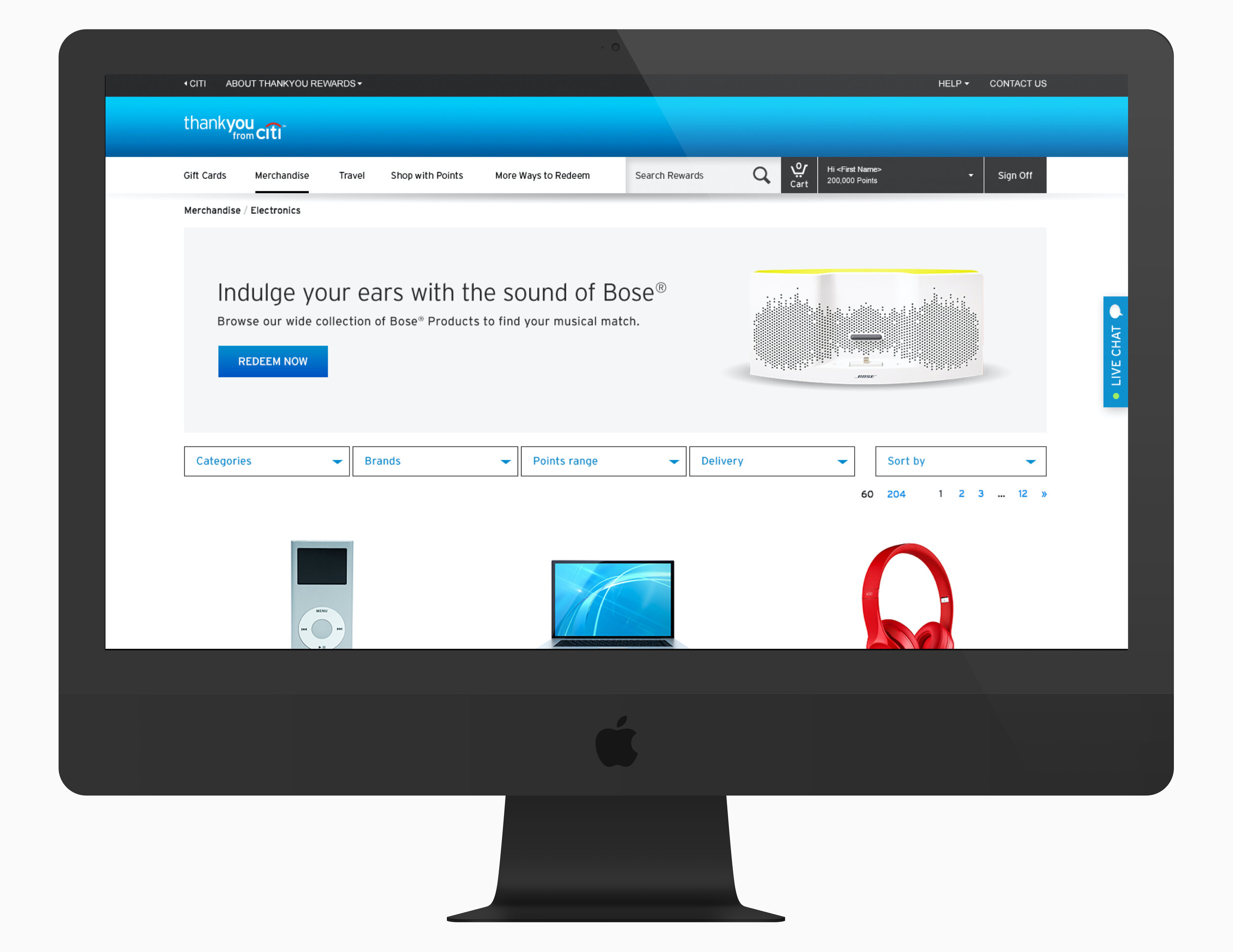
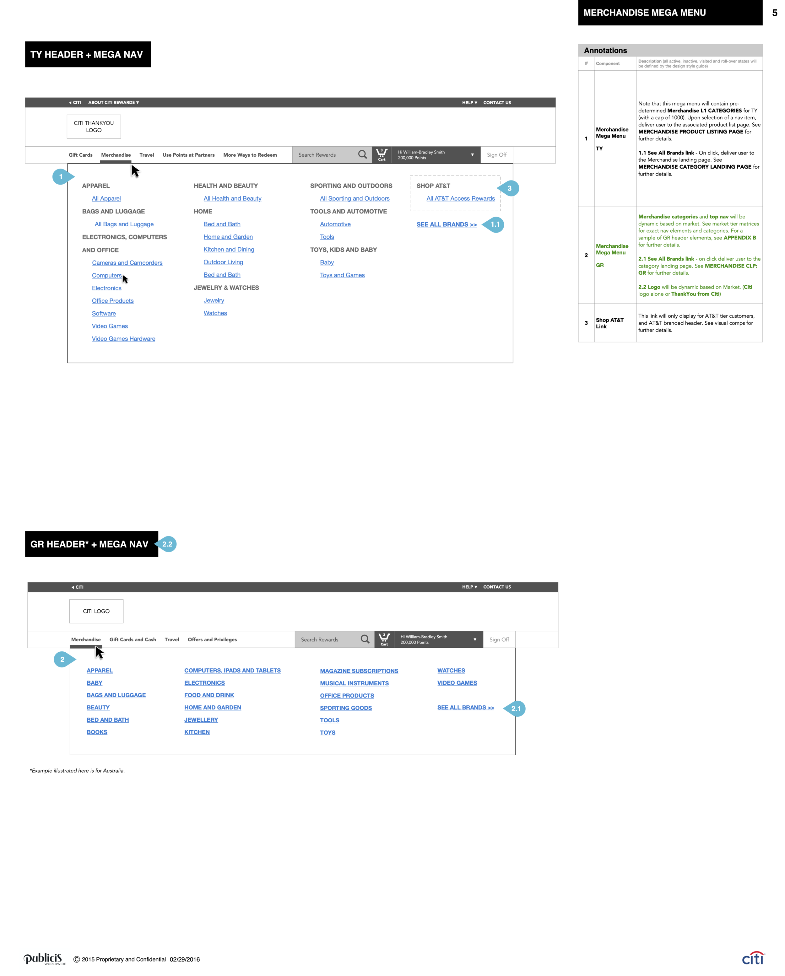
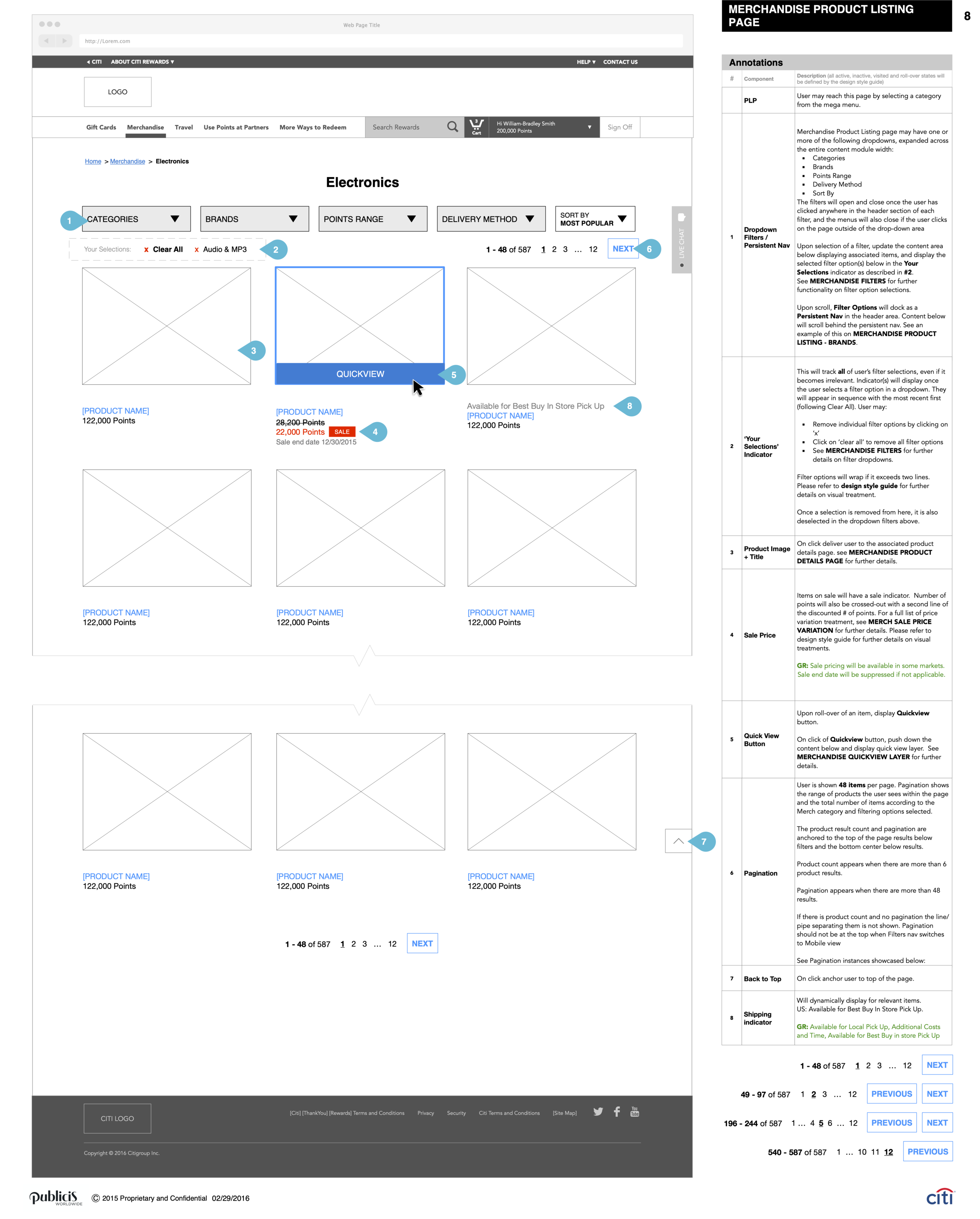
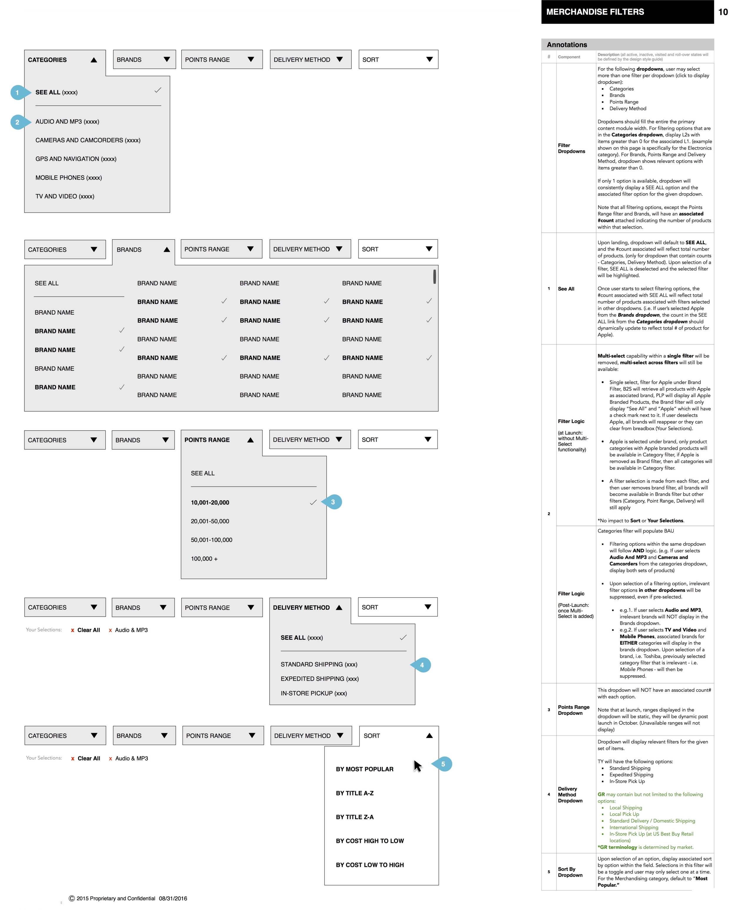
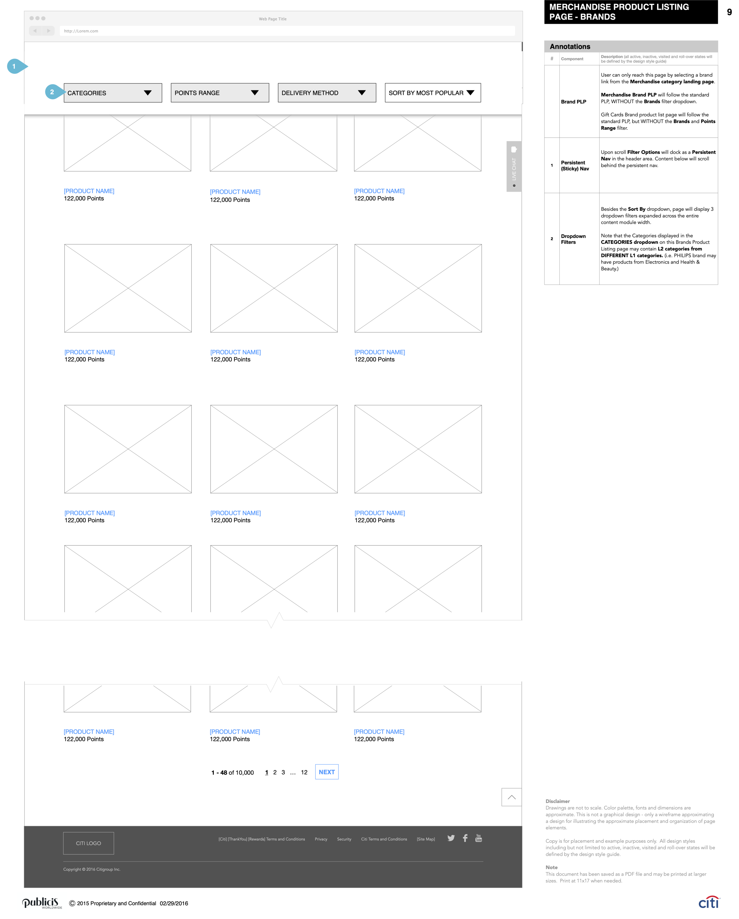
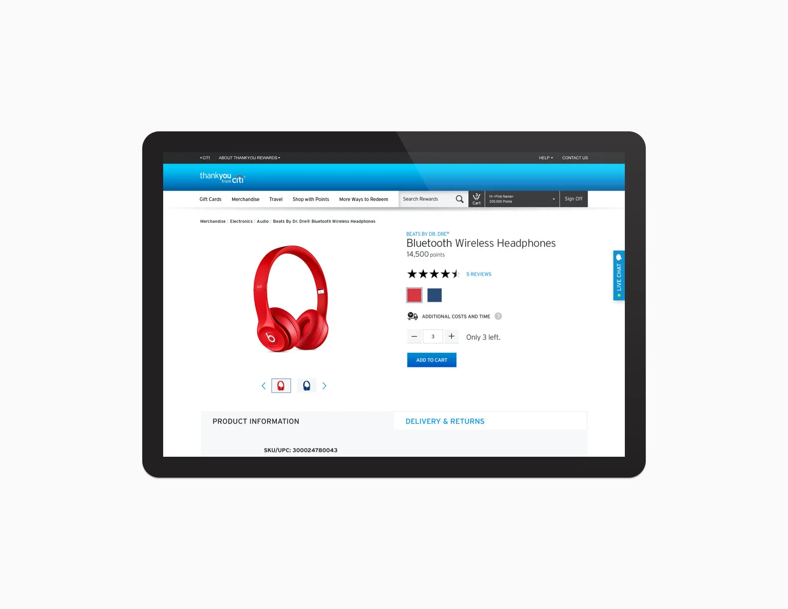
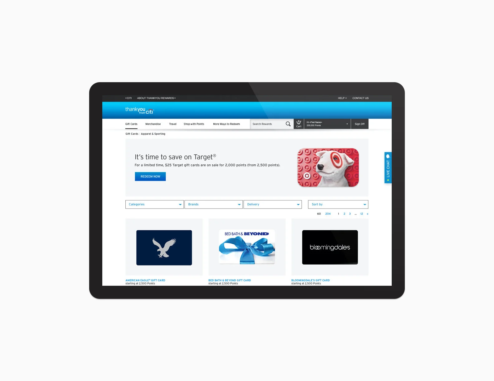
To help users navigate to the desired category, we created a mega-menu - listed alphabetically for easy scanning. Users can navigate to the desired listing page (PLP) by using the mega menu or by selecting a brand from the landing page. Once user is on the PLP, we give users the opportunity to filter by categories, brands, points range, and delivery method. Filter is docked in the header area so users can quickly refer to it in case the vast amount of offering becomes overwhelming.
UX Challenge 2: Checkout
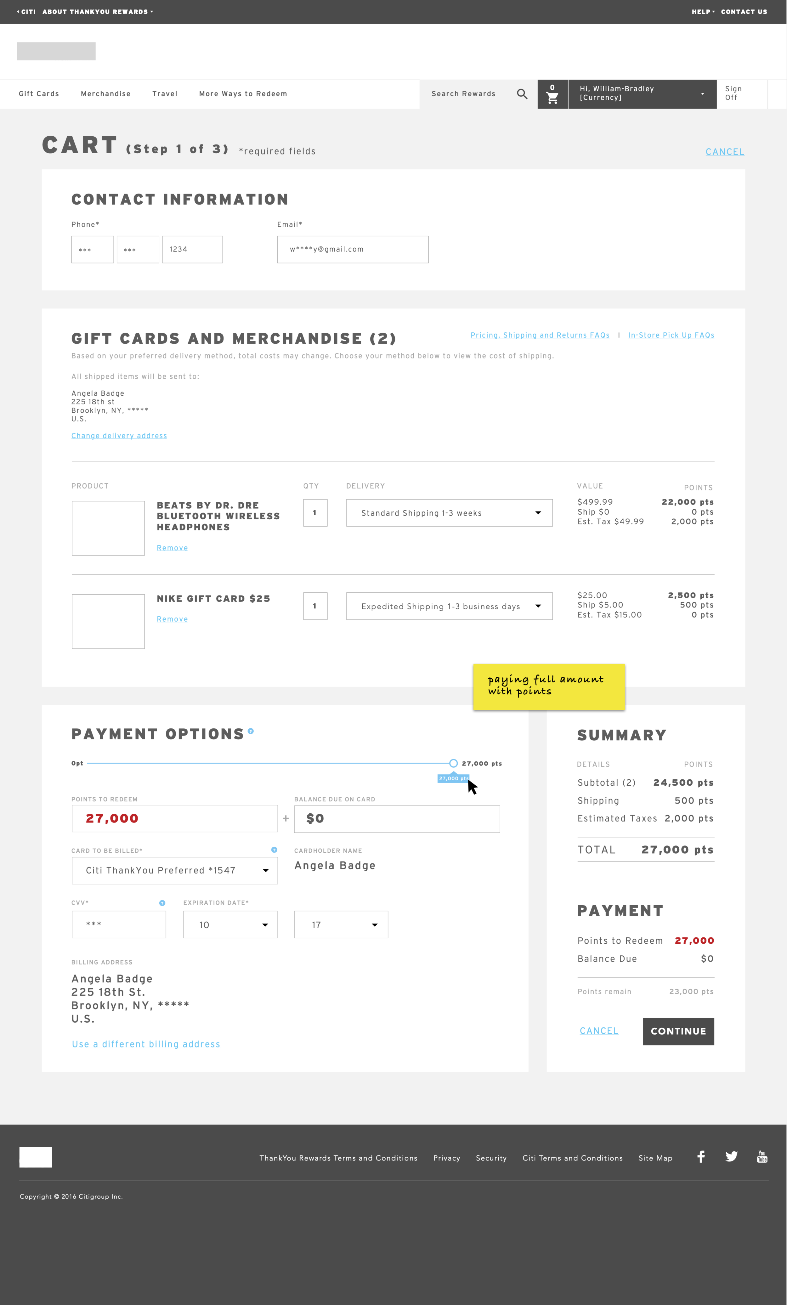
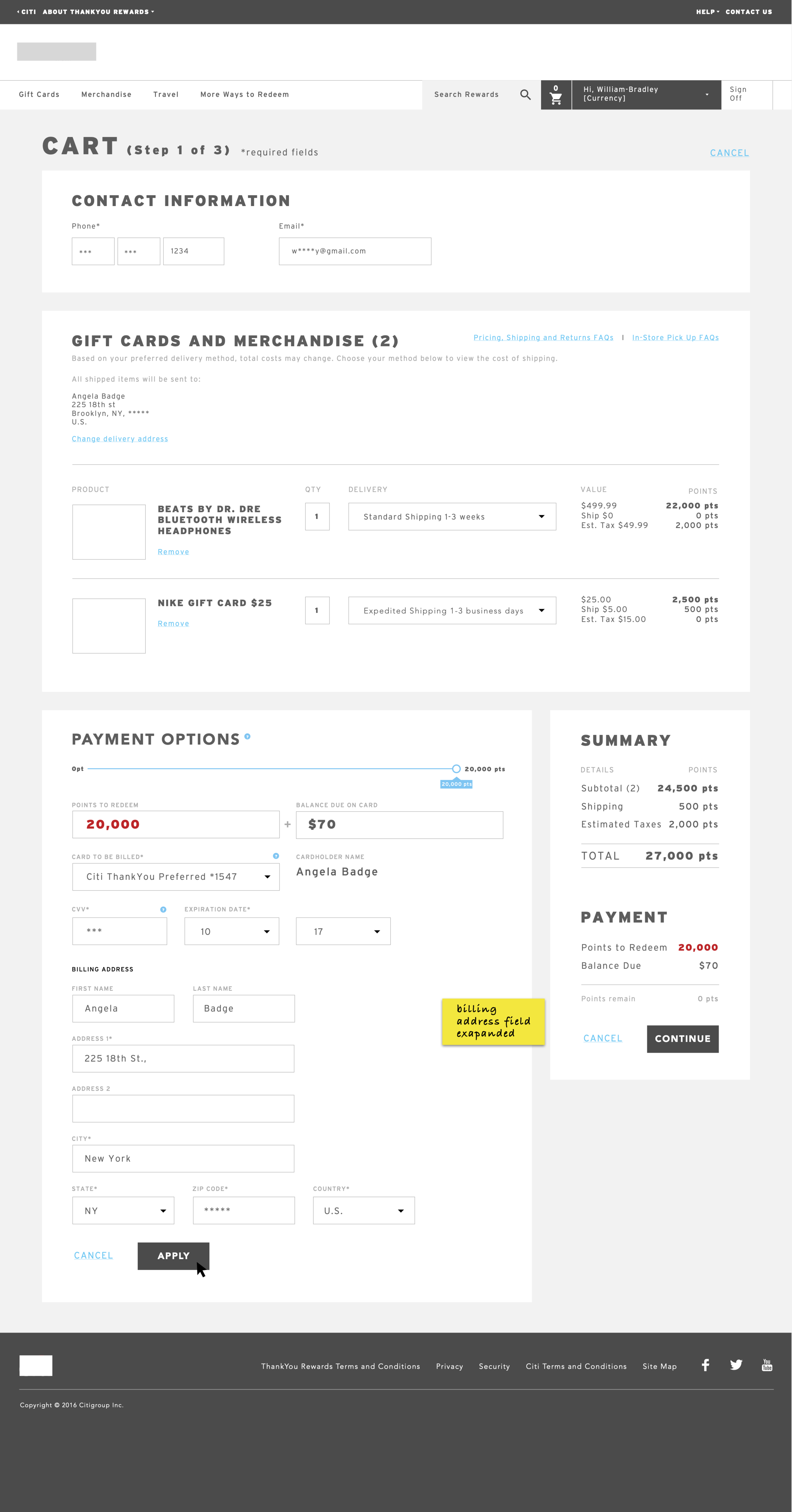
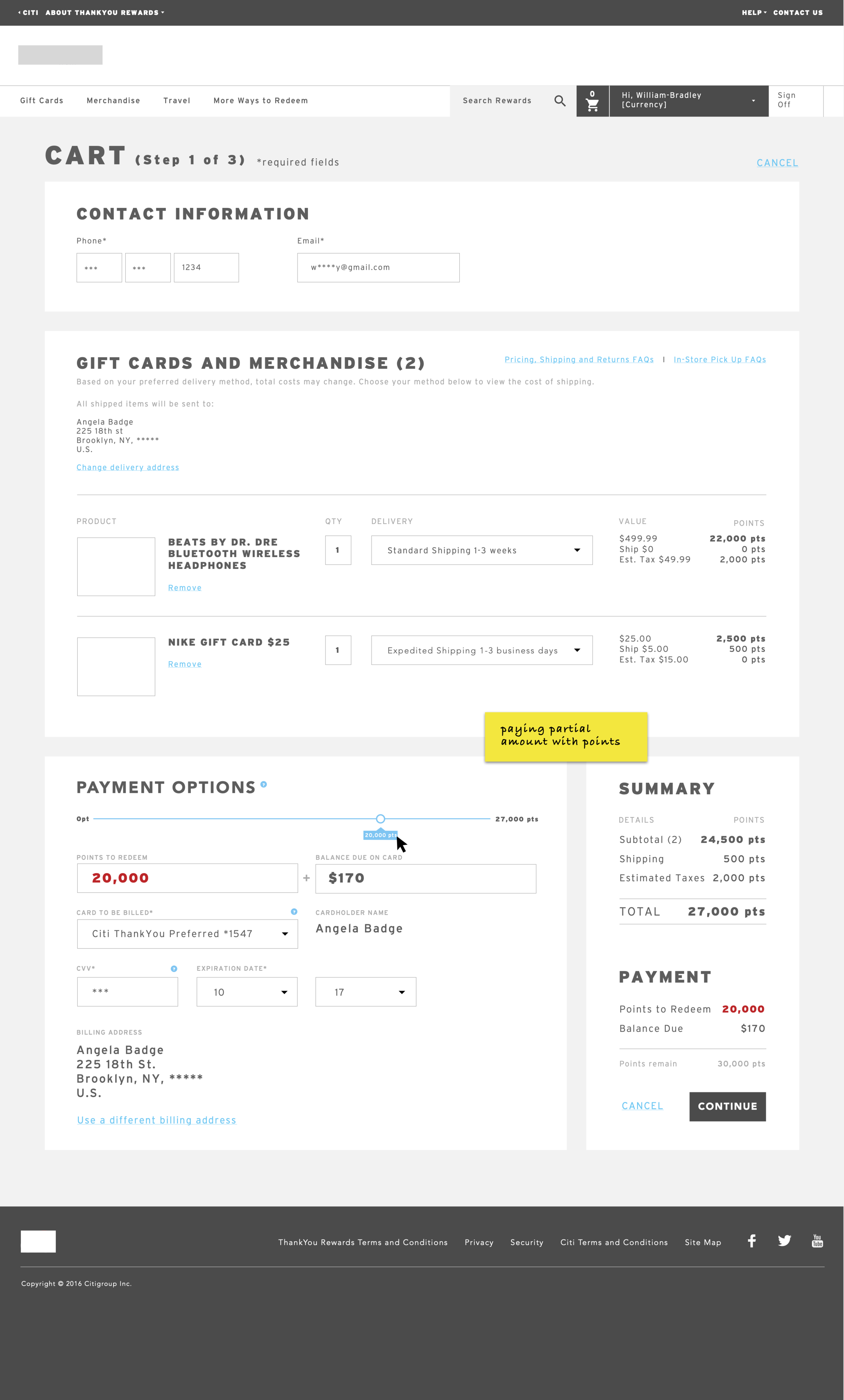
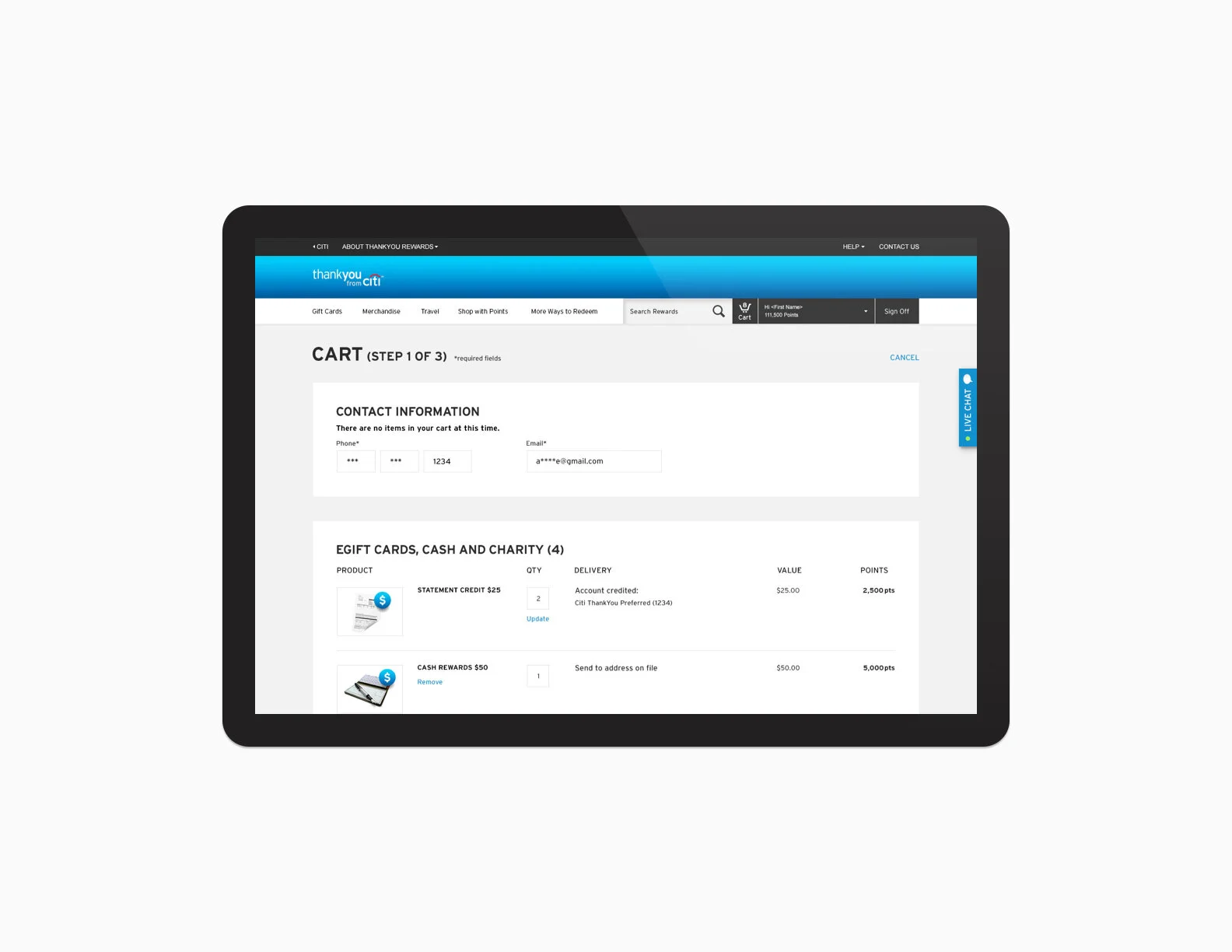
To streamline the checkout experience, we created a simple 1-page process that can accommodate for rewards added to the cart from all categories. (Previously each reward offering all had separate checkout experiences). Cart is organized into different sections on step 1, for fulfillment purposes. User then has the opportunity to review their selections on step 2, and clicking confirm to receive their final confirmation.
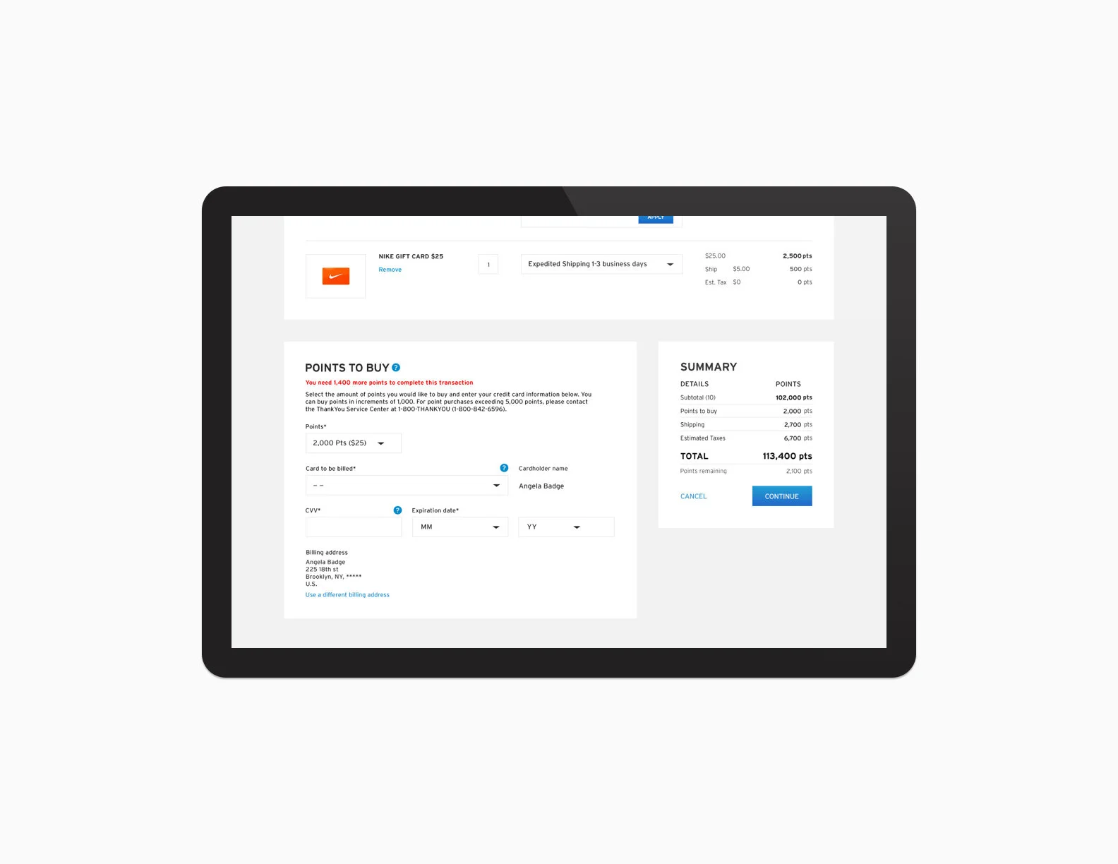
In the sample screens below, user is able to utilize the slider to intuitively split their transaction into paying with points and paying with credit. The summary to the bottom right corner of the cart allows them to review how much points they're spending and how much points they will be left with after this transaction.

